Knowledge › Basics
Basics
How to create your own signature: step by step, with ideas
From a blank page to a signature you can write without thinking: how much of your name to use, the capital and the ending, ten style ideas, simple tests and a one-week plan.
Most people never design their signature. At some point, for a first ID or a bank card, they had to write something, and whatever came out of the pen that day stuck. If you're wondering what yours should look like, because your first ID is coming up, because you're tired of the versions doodled in the margin of your notebook, or because a new name, a new job or a new chapter is ahead, you're in the right place. A good signature doesn't need beautiful handwriting, just a few good decisions and a little practice. This guide takes you from start to finish: what you need it for, how much of your name to include, choosing a capital, slant and ending, ten style ideas, how to test it, and how to make it yours in a week.
Why it feels hard, and why you don't need talent
A signature is an odd thing to design. It has to be fast, consistent, recognisable and yours, all at once. Your handwriting changes from day to day, but your signature should stay the same for years. That's why so many people feel they'll never have a nice one: they try to make their everyday handwriting prettier, when a signature isn't handwriting at all. It's a practised movement.
That's good news. Anyone can learn a movement, whether their handwriting is messy or neat. Designing a signature means picking the few shapes your hand enjoys writing and building them into a line that comes out the same even when you rush. Decoration is the least important part.
A signature isn't nice handwriting. It's a movement your hand repeats the same way every time.
Before you pick up a pen: what is it for?
Before writing anything, think about where you'll use it. A student ID, a bank card, a contract and a delivery terminal all offer different space, a different pace and a different audience. Knowing which will be most common makes it easier to decide how readable, how long and how decorative it should be.
- First ID, student card, bank card
- Small, fixed boxes
- It needs to stay the same for years
- Keep it simple and easy to repeat
- You can refine it later, but keep the core
- New name, new job, new business
- Lots of contracts, signing in front of others
- It should look confident and tidy
- There's room for character and flow
- Switch deliberately, all at once
Either way, in everyday life your signature often lands in a tiny space. If you remember just one thing from this guide, make it this: design it to work small and in a hurry. We have a separate piece on signing in very small spaces.
Step 1: collect samples from your own hand
Don't start from a finished example; start from what your hand does on its own. Take a blank sheet and write your name twenty times, slightly differently each time. The goal isn't beauty yet, it's collection: you want to see which shapes come naturally and where the pen hesitates.
- 1Write your name normally five times. The way you'd sign for a parcel, without thinking.
- 2Write it slowly five times, in your best hand. Notice which letters you enjoy and which you tiptoe around.
- 3Write it very fast five times. Whatever survives speed is your hand's real movement.
- 4Write it large five times, across a whole line. This shows where your hand wants to loop or swing.
- 5Circle what you like. Not whole signatures but details: a capital, a connection, an ending.
The circled details are your raw material. Almost everyone has a letter or two that just flows, and a movement or two that stays clean at speed. Build on those. If a letter always feels awkward, make a note: you'll simplify it later.
Step 2: decide how much of your name to include
A signature doesn't have to be your full name. Some people write both names in full, others an initial and a surname, others a monogram and a line. This is one of the biggest decisions, because it sets the length, the pace and how readable it is. Let's take “Emma Clarke” as an example.
- Full name: Emma Clarke. The most readable and safest choice, great for a first signature. It's longer, so it can feel cramped in small boxes.
- Initial and surname: E. Clarke. Tidy, formal and shorter. The initial can be a plain capital or a sweeping mark.
- First name and initial: Emma C. More personal, good if your first name is distinctive or what people actually call you.
- Two initials and a line. “E” and “C”, then a wave or a trailing stroke. Fast and modern but less readable; ideal for small spaces.
- Readable start, tapering end. “Cla” is legible, the rest flows into a wave. The most common adult signature: the start shows who you are, the end sets the pace.
If you're unsure, start with the full name and shorten only if the tests show it's too long. Shortening is always easier than adding readability to a mark that's too short and abstract. We go deeper into how readable a signature should be in a separate piece.
Step 3: the capital, the face of your signature
When someone glances at a signature, they see the capital first. It's the tallest, most animated shape, and often the only part still readable when you rush. That's why it deserves the most time. A good starting point is a capital about two to two and a half times the height of your small letters.
- Pick one signature feature. A loop, a long entry stroke or a wide curve. One is enough; more ornament comes out a little differently every time.
- Simplify. A school capital can take five or six strokes. Drop whatever costs time but adds little, like the crossbar of an “A”.
- Connect it to the name. Find the shortest curve from the end of the capital to the start of the next letter, so you don't have to lift the pen.
- With two capitals, choose one face. If both names start with a capital, let only one carry the emphasis and keep the other simple.
We have a separate, detailed guide to designing the capital of your signature, including easy and hard letters, accents and two-letter combinations.
Step 4: slant, size and rhythm
With the capital in place, it's time for the rest of the line. Three things matter here: which way it leans, how big it is, and the rhythm in which the letters follow each other. These shape the overall impression far more than any decoration.
- Slant. A slight rightward lean feels energetic and forward-moving; upright feels calm and orderly. A leftward lean can be yours too, as long as it's consistent. Above all, the capital and the small letters should lean the same way.
- Size. Too big and it won't fit in boxes; too small and it looks hesitant. Aim for small letters you can write comfortably on an ordinary signature line.
- Rhythm. The spacing between letters and the regularity of the waves. Even rhythm reads as composed; letters that stretch out and then bunch up read as rushed.
- Baseline. A signature can run straight, rise gently or wave. A slight rise comes naturally to many people and feels open and positive.
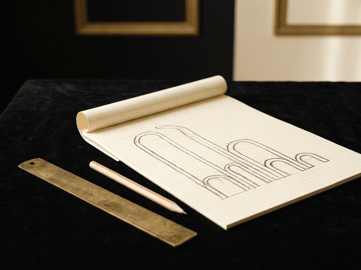
Step 5: the ending, the final stroke
The ending is the last movement of a signature: an underline, a trailing line, a loop, or nothing at all. It's where many good signatures go wrong, because an ending that's too big or too ornate drowns everything else. A good ending frames the name and shows the pen finished with confidence.
- Trailing line. The last letter thins out as the pen lifts. The simplest, most natural ending; it suits almost any signature.
- Underline. A line under the name, often swinging back from the last letter. Decisive and slightly formal; don't let it run longer than the name.
- Closing loop. A big, open loop that runs back under the name. Striking, but only if the capital is more restrained.
- No ending. The name simply stops. Clean and modern, and often best for short names.
We cover signature endings, their proportions and common mistakes in detail in a separate article. Design the ending together with the capital: between them, they set the frame of your signature.
Ten style ideas if you don't know where to start
If you still can't see a direction after collecting samples, pick one of the styles below and write your name in it five times. Don't copy anyone; borrow the direction only. The letter shapes should stay yours.
- Classic cursive. Your full name in joined letters that recall school cursive, with a slight rightward slant. Timeless, readable and at home anywhere.
- Minimalist. Clean, simple letters with no ornament, often with a shortened name. Modern, calm and great at small sizes.
- Big capital, flowing finish. A strong, readable capital, then the name tapers into an even wave. The most common adult signature.
- Monogram. Two initials intertwined or linked, followed by a short stroke. Compact and distinctive; handy for initialling pages too.
- Long sweep. A long, even trailing line after the name. Dynamic, but make sure it doesn't spill out of small boxes.
- Underlined. Any style finished with a decisive underline. Confident and tidy.
- Tall and narrow. Stretched, compact letters with tight spacing. Elegant, and it keeps long names in check.
- Round and open. Wide, round shapes with generous inner spaces. Friendly and approachable, especially for short names.
- Angular and sharp. Pointed turns instead of loops, straight lines. Decisive, fast and hard to smudge.
- First name only. For informal moments, like signing a book or a card. Official documents usually need your surname too; the institution always decides.
Styles mix freely: a minimalist signature can take an underline, classic cursive a long sweep. If you're torn between two, write both on a sticky note and look again the next day. The one you still like tomorrow is the better one.
Step 6: test before you decide
By now you probably have two or three candidates. Don't choose between them on looks; choose on whether they survive everyday life. A signature that's gorgeous at a desk but falls apart on a terminal or in a tiny box won't serve you well.
- 1Speed test. Write it five times as fast as you can. If it stays recognisable and similar, good. If it falls apart, simplify.
- 2Small-space test. Draw a 4 × 1 cm box and sign inside it. Does it fit? Is the capital still readable?
- 3Distance test. Pin the sheet up and look from arm's length, then from across the room. Does it read as one unit or break into pieces?
- 4Repeat test. Sign ten times, one under another, then hold the sheets together against the light. How closely do the shapes line up?
- 5Standing test. Sign standing up, holding a notebook in your hand. In real life, that's often how it happens.
The candidate that passes the most tests wins, even if it isn't the most decorative. You can add flourish later; reliability you can't.
Common mistakes with a first signature
These mistakes come up for almost everyone designing a signature for the first time. Each is easy to avoid once you spot it.
- Too much decoration. Three loops, two curls and a long underline: lovely once, different every time. Keep one main feature.
- Copying someone else's. A celebrity's, a parent's or a friend's signature was made for their hand. Borrow the direction, but keep your own letter shapes.
- A form that's too slow. If you have to concentrate to sign, it will drift when you hurry. A good signature is a movement, not a drawing.
- Too small or too big. A tiny signature looks unsure, a huge one won't fit. Design for an ordinary signature line.
- Constant changes. If you write a different version every week, your hand never learns it. Choose, then stick with it for at least a few weeks.
- Testing only on paper. Many signatures are made on screens now. Try it with a finger on a phone: does the core survive?
The best signature isn't the prettiest; it's the one that comes out the same the twentieth time.
The first week: making it yours
A new signature becomes yours when you no longer have to think about it. That takes short, regular practice rather than long afternoons. Ten minutes a day for a week is enough to make the movement stick; our practice guide covers the general methods.
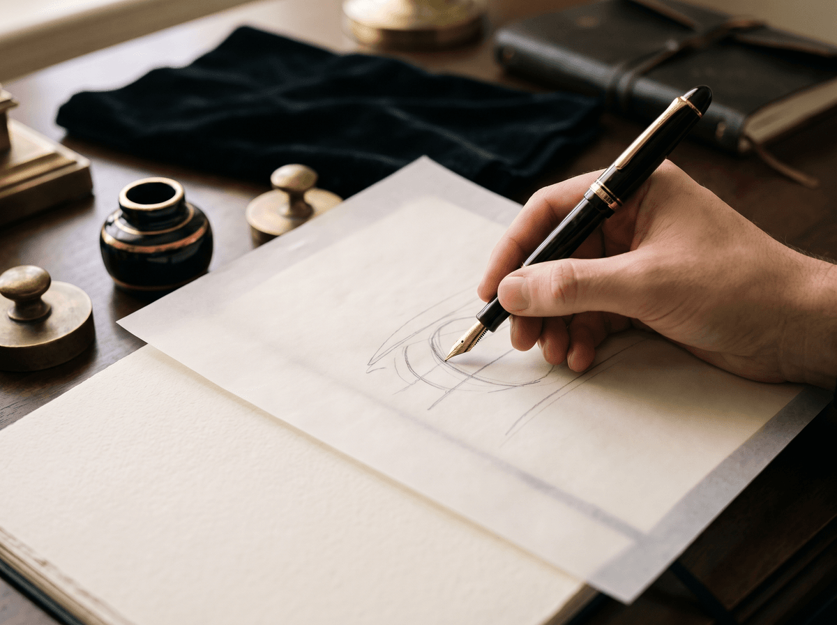
- 1Day 1: slow and large. Write your chosen form large and slowly across a whole page. Pay attention to every connection.
- 2Day 2: normal size. The same form at your usual size. Wherever the pen catches, look for a simpler connection.
- 3Day 3: pace. Speed up gradually. Two lines slow, two at medium pace, two fast.
- 4Day 4: eyes closed. Sign a few times with your eyes closed. If it's still recognisable, your hand has it.
- 5Day 5: real situations. Sign standing up, in a small box, with a cheap pen, with your finger on a phone.
- 6Day 6: repeat test. Ten signatures one under another. How alike are they?
- 7Day 7: compare. Put the first day's sheet next to today's. If today's is steadier and more confident, you're ready to start using it.
Once you start using it, it will keep settling over the next few weeks. That's natural: your hand slowly makes it its own. What matters is keeping the skeleton, meaning the capital, the length and the ending, unchanged. Your choice of pen and paper also makes a big difference to how good the line feels while you practise.
If you'd like help: design it with Calligra
If you'd like to see what your name could become before filling a whole notebook, Calligra can help. Type your name, sign your current version with your finger, and get an analysis of how readable, consistent and distinctive it is. After a few style questions it draws your signature for your name in the style you choose, and you can try other styles to compare side by side.
You can then learn your chosen design letter by letter: the capital first, then the connections, then the whole thing, in a dotted practice mode that shows how consistent your strokes are. It's the same structure described in this guide, with most of the trial and error done for you.
Whichever route you take, the essentials are the same: a good signature of your own comes from a few deliberate decisions and a week of practice. To read more about what makes a signature look truly confident and professional, see what makes a signature look professional.
The one sentence worth taking away
Your own signature isn't a prettier version of your handwriting; it's a practised movement. Collect samples from your own hand, decide how much of your name to include, design one distinctive capital, keep slant and size consistent and choose a simple ending. Test it fast, small and standing up, then practise ten minutes a day for a week. A good signature is the one that comes out the same the twentieth time.
Questions
At what age should I create my own signature?
When you first need to use one regularly, for example for your first ID, student card or bank card. Many people design theirs as teenagers and refine it later. If you're designing one now, choose a simple, easy-to-repeat form: it will last for years and you can still develop it later.
Can my signature be unreadable?
There's no general rule that it must be readable, and many adult signatures are only partly legible. What matters is that it's consistent and recognisable. A readable capital or the start of your surname helps a lot, especially for a first signature. If a particular institution expects more, they'll tell you.
Can I copy a celebrity's or a friend's signature?
Take inspiration, but keep the letter shapes your own. Copying another person's signature is a bad idea not only because it was made for their hand, but because a signature is there to identify you. Borrow the direction, like the slant or the type of ending, and build it around your own name.
Does it have to include my full name?
Not necessarily. Many people write just their surname and an initial, or let part of the name taper into a wave. For a first signature, the full name is the safest choice. What's accepted on a particular document or contract can vary by institution and country; if you're unsure, ask them.
Can I change my signature later?
Yes, a signature can be changed. The old form stays on documents you've already signed and in existing records until you update them, so it's worth switching deliberately, all at once. Where and how to register the new one varies by institution; we cover the practical steps in a separate article.
How long until a new signature feels natural?
With ten minutes of practice a day, the movement usually settles within a week, and after a few weeks of use you'll write it without thinking. If a form still falls apart after two weeks, it's probably too complex and worth simplifying.
Try it with your own name
Read these too
KnowledgeStyleHow to improve your signature: 7 small changes that make it look better
You don't need a new signature for it to look better. Seven small changes to the capital, the slant, the proportions and the ending make your old signature tidier, while it stays recognisably yours.
 Basics
Can you have more than one signature? Official, everyday and autograph
One for the bank, one for signing for parcels, and a showier one in case someone ever asks for your autograph. Here's when several signatures are a good idea, when they cause trouble, and how to keep them in order.
 Basics
Cursive vs print signature: pros, cons, and which one suits you
Plenty of people print rather than write joined-up these days, and wonder whether they can sign that way. They can. Here's what cursive does better, what print does better, the semi-cursive middle ground, and how to turn a printed name into a real signature.