Knowledge › Style
Style
Designing the capital: the face of your signature
The first letter carries the character, the rhythm and most of the recognisability. Proportion, entry strokes, loops, connections and simplification, step by step.
One glance at your signature and the capital is what people see first. It's the tallest, most animated shape in the line, and everything after it lines up with it. The capital is the face of the signature: it makes it recognisable, sets the pace, and in a hurried signature it's often the only readable part. Below we cover size, entry strokes, loops, connections, easy and hard letters, double initials, monograms, simplification and common mistakes, and finish with a two-week practice plan.
Why the first letter matters most
The eye moves left to right and rests longest on the first shape it meets. The rest of a signature is often a running wave in which small letters blur and the ending trails off. The capital rises above the line and anchors it. If that anchor is strong, the signature stays yours even when the rest is rushed.
It's practical, too: when a signature is compared with an earlier one, large, prominent shapes are the easiest to match. The capital is ornament and identifier at once.
The small letters spell your name; the capital shows who you are.
Proportion: how big should the capital be?
A good starting point is a capital about two to two and a half times the x-height of your small letters (the body of an “a” or “o”). Smaller, and it gets lost; much bigger, and the signature turns top-heavy, with the small letters crouching at its feet.
Width matters as much. Narrow and tall reads as elegant; wide and round reads as open and friendly. A long name like “Alexandra Winterbottom” benefits from a narrower capital. A short one like “Ed Orr” can take a fuller capital that gives the whole thing body.
- 1Write your name normally. The way you'd sign for a parcel, not your best handwriting.
- 2Measure the small letters. Squared paper or a ruler: how tall is an “a”?
- 3Write three capitals. At two, two and a half and three times that height, each with the same continuation.
- 4Look from arm's length. Which reads as one unit rather than a giant and a row of dwarfs?
- 5Note the ratio. Write it in the margin so you stick to it next time.
The entry stroke: where the pen comes in
The entry stroke is the small movement with which the pen lands before the letter proper begins. It decides whether the signature takes off or stalls: a confident curve sets a rhythm, while a hesitant dot or hook shows the hand stopped to think.
- Rising curve from below. The pen sweeps up from the lower left to the top of the stem. Natural and cursive; suits almost every letter.
- Drop from above. A small loop or teardrop at the top, then the stem pulled down. Slightly formal; lovely on F, T and J.
- Long lead-in. A flat stroke arriving from the left. Dynamic and modern, but it easily grows too long.
- No entry. The pen starts at the top of the stem. Clean and fast; give the rest of the letter more character.
Test it: write the capital ten times and watch for a tiny pause after the entry. If it's there every time, the entry is a separate decision rather than part of the letter. Shorten it or fold it into the first stem.
Loops: when they help and when they hurt
One well-placed, open loop adds momentum and recognisability. Trouble starts when loops multiply: three little ones look cluttered and come out differently each time, which undermines recognition.
- One big loop, not several small ones. Place it where the letter naturally turns: the foot of an L, the back of a D, the top of an S.
- Keep it open. A loop that fills with ink reads as a blot. Leave air inside.
- Mind the direction. Counter-clockwise follows cursive and comes easily to most hands; clockwise is more striking but needs practice.
- Don't compete with the ending. If the signature closes with a big loop, keep the capital's modest, and vice versa.
Design the capital together with the final stroke, since the two frame the signature; see our article on endings.
Connecting the capital to the name
A fine capital loses force if the pen lifts and the small letters start somewhere else. The connection carries the capital's last movement into the second letter. It's optional, but where it works the signature becomes more unified and faster.
There are three options. A direct connection runs the last stroke straight into the next letter; with A, M, N or K it almost happens by itself. A return connection curls back and joins from below, which suits D, O and P. A deliberate gap leaves the capital standing alone; fine, as long as the gap is the same every time.
- 1Find where the capital ends. High, middle or low?
- 2Find where the second letter starts. An “a” starts high, an “i” low, an “r” in the middle.
- 3Join them with the shortest curve. If they're far apart, try a capital whose ending lands closer.
- 4Write it twenty times, fast. If the link survives speed, keep it. If it always breaks, accept the gap or change the form.
Easy and hard capitals
Some letters hand you a loop and momentum; others need more design work. A quick tour:
- A. Generous: a natural high point, and the right leg runs towards the next letter. Drop the crossbar or turn it into a loop.
- K. Moderate. A loop can join stem and upper arm; the leg is a great launch for the connection.
- M. Easy and rhythmic, already a wave. Keep it from getting too wide.
- S. One movement that asks for a loop. Just don't let it grow too big.
- B, D, P, R. Stem and bowls start separately; a loop from above merges them into one stroke.
- H, T, F, E. Mostly straight lines. The entry and one loop supply the momentum; a T's crossbar can become a long arc over the name.
- O, C, G. Closed and round. Open the O at the top and let the connection run out of the opening.
Pairs like Th, Ch or Mc, and the Hungarian Zs, Gy, Sz, Cs, Ny, have only one capital; the second letter is lowercase. Treat it as the start of the connection. In Sz the S curve runs straight into the z; the y of Gy can loop back under the whole signature.
Two capitals: first name and surname
Write both names and you have two capitals; decide which carries the emphasis. Order varies too: in Hungarian the surname comes first, so “Nagy Péter” leads with N, while “Peter Nagy” leads with P. Two equally big, equally decorated capitals almost always compete and split the signature in two.
- Surname capital larger, more decorative
- First-name capital simpler
- Traditional, orderly feel
- Suits formal settings
- First-name capital gets the flourish
- Surname shorter, maybe an initial
- More personal feel
- Good for a distinctive first name
A reliable trick is to let the two capitals overlap: the P's bowl growing out of the N's stem, say. For Peter Nagy, a tall P, a lower, lively N and a shortened “agy” make a fast, balanced signature.
Two capitals of equal weight are two signatures on one line; decide which one is the face.
Monograms: the capital as the signature
A monogram, just your initials intertwined, is quick and distinctive: ideal for initialling pages or marking books and drawings. Whether it's accepted in place of a full signature is up to the institution.
- Side by side. Separate letters on one baseline. Simplest and most legible.
- Overlapping. One stem crosses the other letter. Compact and distinctive.
- Shared stem. H and K can share a single vertical. The most compact form.
- Nested. One letter inside another. Striking but slow; best kept decorative.
Build the monogram around the same capital as your full signature, so the two read as one family.
Simplification: keep the characteristic movement
A schoolbook G has five or six strokes; a signature G can be one curve with a loop. Simplifying means finding the part the letter can't be recognised without, and cutting what only costs time.

- 1Write it slowly, school-style. Count the strokes and pen lifts.
- 2Mark the essentials. The A's apex, the K's junction, the E's middle curve.
- 3Remove one element. Whatever costs most and adds least, like the A's crossbar.
- 4Join what's left. Where you lifted the pen, try a loop or a sharp turn instead.
- 5Test it on someone. If they name the letter at once, you're on track.
More on balancing legibility and character in our legibility article. If only one letter in your signature is readable, let it be the first.
Common mistakes and quick fixes
- Capital too big. Top-heavy signature. Reduce the height; extend downwards or slightly wider instead.
- Too much ornament. Comes out differently every time. Keep one flourish.
- Hesitant entry. A dot or hook where the pen lands. Start moving in the air so the pen touches down in motion.
- Break after the capital. Find the shortest curve to the second letter, or make the gap deliberate.
- Mismatched slant. Practise between slanted guide lines until capital and small letters lean together.
- Closed-up loop. Bigger loop, faster movement, less pressure on the turn.
- Wandering accent. Fix its position, or fold it into a stroke.
A two-week practice plan
A new capital is yours when you stop thinking about it. Ten minutes a day for two weeks beats one long afternoon. For general methods, see our practice guide.
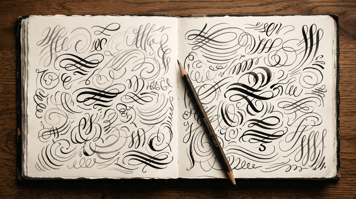
- 1Days 1–2: variations. Fill a page with versions: different entries, loops, sizes. Collect, don't judge.
- 2Day 3: shortlist. Circle three, write each with your full name, see which suits the rest.
- 3Days 4–6: one form. Practise only that, slowly, then faster.
- 4Day 7: distance test. Look from arm's length, then across the room.
- 5Days 8–11: the connection. Twenty fast repetitions of capital plus second letter daily.
- 6Days 12–13: real conditions. Standing up, in a narrow box, with a worse pen.
- 7Day 14: compare. Day one's page next to today's. Steadier and more confident? Done.
Calligra's letter-by-letter lessons follow the same order: the capital alone, then connections, then the whole. Its scored practice mode shows how consistent your capital is between attempts.
Special cases: short, long and unusual names
Very short names like “Ed Orr” or “Ida Ek” make the capital almost the whole signature, so it can be bigger and livelier, even sweeping under the name. Long names like “Maximilian Fitzgerald-Hughes” need the opposite: a clean, legible capital, since the rest will be abbreviated anyway.
Unusual initials like X, Q or Y are distinctive by default; the challenge is legibility. A Q's tail can become the connection, a Y's descender a natural lower loop.
Unsure which direction suits you? Calligra's short style quiz shows the styles that suit you with your own name, each treating the capital differently. And our article on professional signatures helps pull the whole thing together.
The one sentence worth taking away
A good capital is about two to two and a half times your x-height, starts with a confident entry, carries at most one loop and runs into the name with a short curve. With two capitals, pick one as the face. Handle accents, ornament and letter pairs deliberately, and let the speed test decide: whatever stays recognisable when you rush is yours.
Questions
What if my capital is hard to write?
Simplify it. Keep the one or two elements that make it recognisable and drop or loop together the rest: an E can be a double curve, an H two stems joined by a loop. You want a characteristic movement, not a textbook letter. If nothing feels natural, write it fast twenty times and see which way your hand drifts.
Which should be bigger, the first-name or surname capital?
Only one should be emphasised. Traditionally that's the surname, but if your first name is more distinctive or what people know you by, let it lead and keep the surname simple, perhaps an initial. The signature needs one focus.
Can I leave the accent off my capital?
A signature is a personal mark, not the official spelling of your name, so many people drop the accent or fold it into a stroke. If you keep it, make it small and consistent. Whether an institution expects anything varies by place and country; if unsure, ask them.
Can I use a monogram instead of a full signature?
For initialling pages or marking books and drawings, yes. For contracts, official documents or banking, the institution decides what it accepts, and that varies by country. Design the monogram around your full signature's capital so they belong together.
How long until a new capital feels natural?
It varies a lot. Many people find that a few weeks of short, regular practice is enough for the hand to take over, though old habits can return under stress. If you're changing your whole signature, our article on changing your signature covers official records.
I'm left-handed. Should I design my capital differently?
Match stroke directions to your hand. Pushed strokes, like long left-to-right entries, tend to catch, so prefer stems pulled down from the top and short curves arriving from the right. Turn the paper and use quick-drying ink to avoid smudging.
Is it bad if my capital doesn't connect to the other letters?
Not at all. Many fine signatures have a free-standing capital. Just keep the gap deliberate and the same every time; if the small letters start somewhere different each time, look for a short connecting curve.
Try it with your own name
Read these too
Knowledge Style
How to improve your signature: 7 small changes that make it look better
You don't need a new signature for it to look better. Seven small changes to the capital, the slant, the proportions and the ending make your old signature tidier, while it stays recognisably yours.
 Style
Middle name in your signature: yes, if that's the name you use
Emily Rose, whom everyone calls Rosie. James Edward, who has gone by Ned since he was a baby. If you carry more than one name, your signature makes you choose: both, just one, an initial or the nickname. Here's when each one works.
 Style
Signature styles up close: what makes a signature elegant, modern or precise?
Eight styles, all drawn with the same name. Here's which strokes make a signature elegant, dynamic or precise, and where each one holds up in everyday life.