Knowledge › Tools
Tools
Pens, ink and paper for a beautiful signature
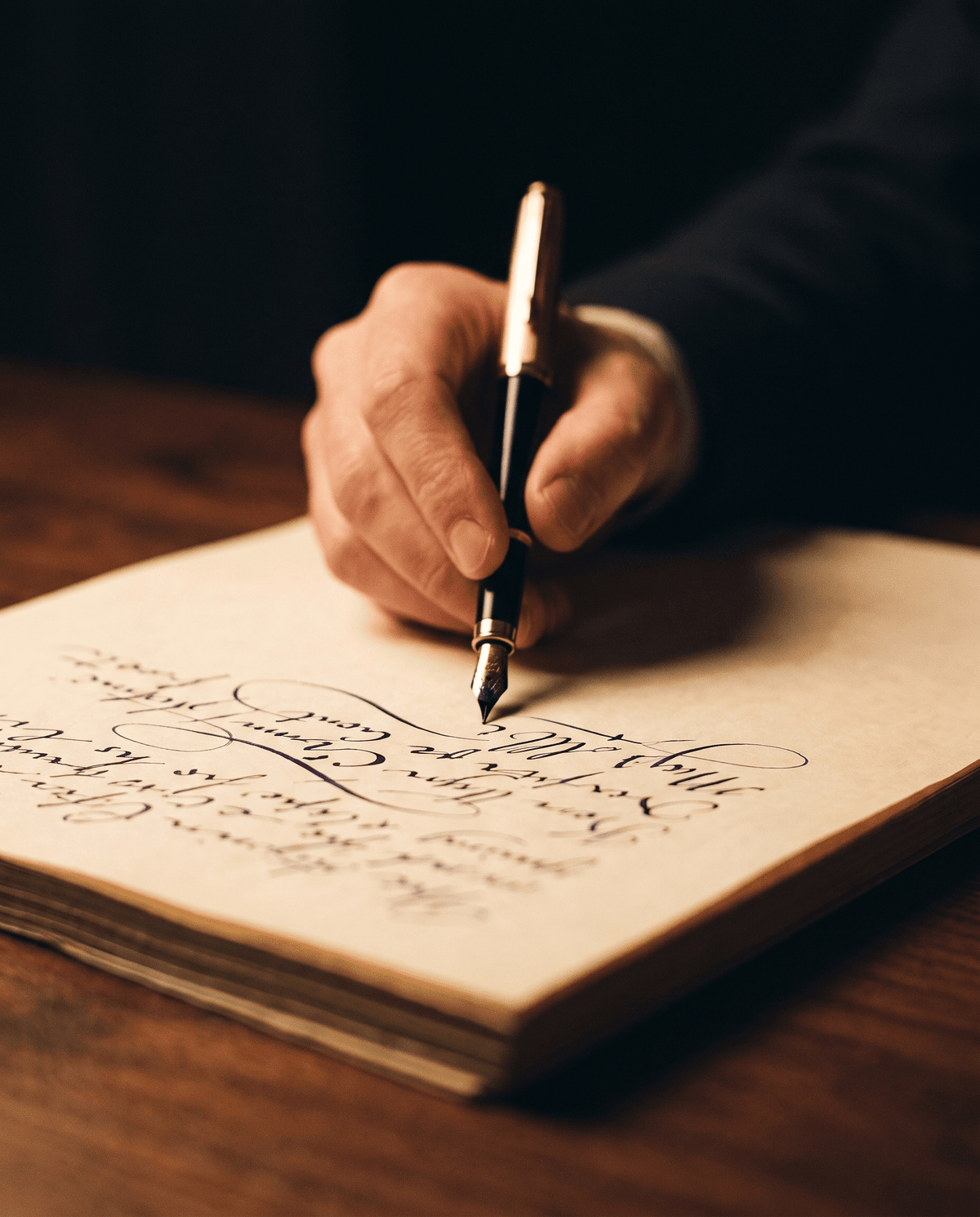
The same movement looks ceremonial with a fountain pen, crisp with a fineliner and casual with a ballpoint. Here's what each tool does well and how to get the best out of it.
We tend to think of a signature as pure shape: letters, curves, a confident finishing stroke. But every signature is also made of material. The colour of the ink, the weight of the line, the flexibility of the nib and the surface of the paper all decide what kind of mark your movement leaves behind. The same name looks ceremonial in fountain pen, decisive and modern in fineliner, and quick and everyday in ballpoint. This guide covers pen types and nib sizes, ink colours, paper, care, awkward surfaces, and how much is actually worth spending.
Why your tools matter
Picture a simple signature, say for “Anna Kovacs”: a large open K, a short connecting stroke, then the arc of the A and a horizontal finish. Written with a cheap ballpoint, the line is equally thin everywhere, and the start and end often carry a slightly hesitant blob. Written with a medium-nib fountain pen, the same signature breathes: downstrokes are fuller, upstrokes lighter, and the finish tapers away. The movement hasn't changed, yet the result is completely different.
Tools affect the movement as well as the look. A pen that glides invites a bolder, more fluid hand; a scratchy ballpoint that needs pressure slows you down and stiffens your wrist. Every tool helps or hinders you in its own way.
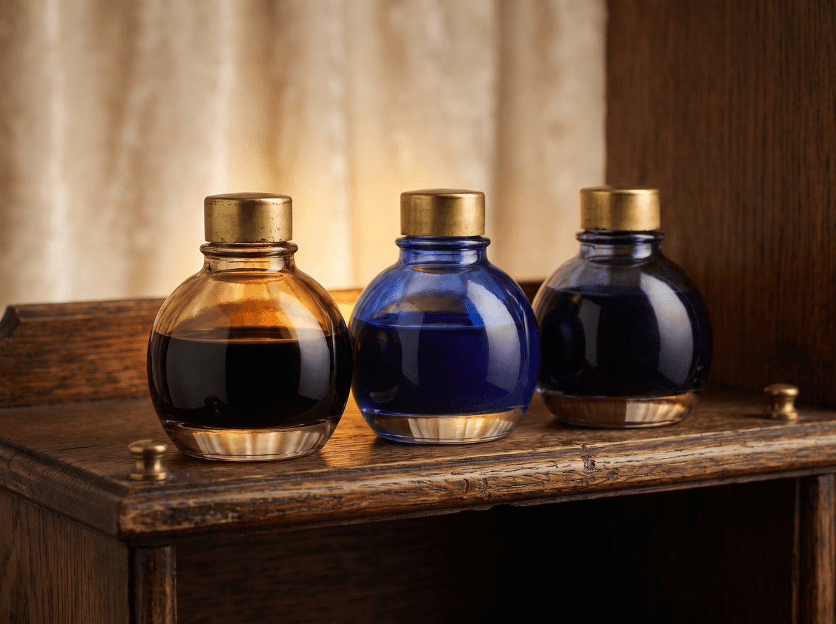
The movement is yours, but the pen, the ink and the paper decide what it leaves behind.
Fountain pens and nib sizes
A fountain pen nib is split into two halves by a fine slit. Ink runs down that slit by capillary action, so your hand only guides; it doesn't press. Nibs are graded by width, and while manufacturers differ a little, the basic scale is much the same everywhere.
- EF (extra fine). A very thin line. Useful for small handwriting and cramped forms, but for a signature it often feels too timid and a little scratchy.
- F (fine). A good all-rounder if your signature is small or dense with loops, because the loops stay open instead of filling in.
- M (medium). For most people this is the signature sweet spot: bold enough to give the line character, not so wide that it smudges into a blur.
- B (broad). A rich, wet line that suits large, sweeping signatures. On a small, busy signature, though, letters can clog together.
- BB and wider. Best kept for decorative, special-occasion use. It dries more slowly and can bleed through thinner paper.
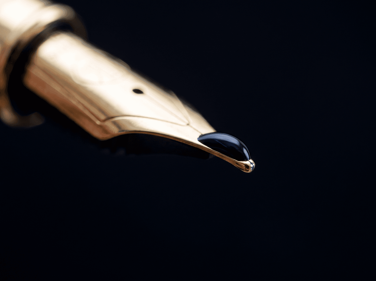
Broad and italic nibs: the secret of line variation
The classic calligraphic look mostly comes from italic and stub nibs. Instead of a round tip, these have a flattened, chisel-like edge. Pull the pen downwards and the wide edge does the work, giving a thick line; move sideways or upwards and the narrow edge takes over, giving a thin one. That alternation of thick and thin is called line variation, and it's what makes the rhythm of a signature visible.
- 1Fix the angle. Hold the pen so the wide edge of the nib sits at about 30 to 45 degrees to the line. Keep that angle throughout; don't let the pen roll between your fingers.
- 2Draw a row of verticals. Make ten identical downstrokes, then ten horizontal strokes. The verticals should be thick and the horizontals thinner. If not, your angle has drifted.
- 3Practise loops. Write a line of l's and e's. Notice where the stroke thins at the top of each loop: that's where the elegance comes from.
- 4Write your name slowly. Take “Peter Nagy”: the two uprights of the N come out thick and the diagonal between them thinner. Go slowly so you can feel where the line changes.
- 5Build up speed. Once the slow version looks good, speed up. A signature is a fast movement, and the nib's rhythm only really comes together at pace.
Ballpoint, gel, fineliner and rollerball
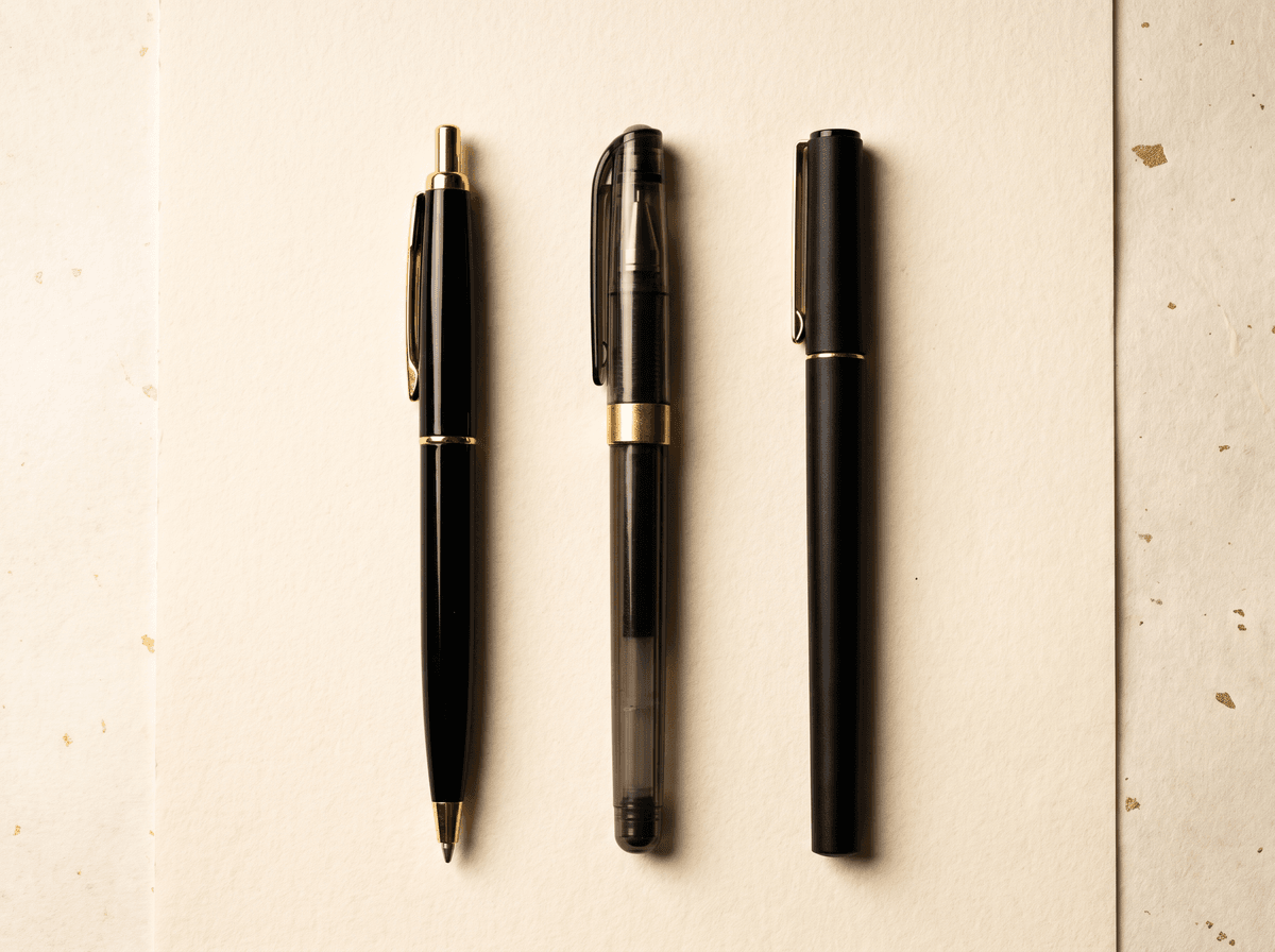
Most signatures aren't made with a fountain pen. They're made with whatever is nearest. Each everyday pen behaves differently and shapes your signature in its own way.
- Ballpoint. Thick, oil-based ink that dries fast and grips almost any surface. But it needs pressure and gives a thin, uniform line. For carbon-copy forms it's the only truly reliable option.
- Gel pen. Dense, vivid ink, a smooth glide and a full line. It looks great but dries more slowly, so it can smear for left-handers and on glossy paper.
- Rollerball. Liquid, water-based ink in a ball tip. The line is rich, like a fountain pen's, but without line variation. A good middle ground if you want an easy glide without a fountain pen.
- Fineliner. A fibre tip with a very even, decisive line. It gives a modern, graphic feel and is excellent for clean, legible signatures. Press too hard and the tip can splay.
- Dries quickly, rarely smudges
- Works on carbon-copy forms
- Needs pressure; thin, uniform line
- Available everywhere, always to hand
- Effortless glide, barely any pressure
- Full, vivid, characterful line
- Slower to dry, can smear
- May bead on glossy or waxy surfaces
One simple rule: if you designed or practised your signature with a fountain pen, always test it with a ballpoint too. If it falls apart with a ballpoint, the shape relies too heavily on the nib. A strong signature stays recognisable with any tool. We go into this in more detail in our practice guide.
Ink colours: black, blue and navy
The great majority of signatures are written in one of three classic colours. Each has its own mood and says something slightly different about you, even if only quietly.
- Black. The most neutral and the highest contrast. It shows up well on photocopies and scans, which is why many people choose it for official paperwork.
- Royal blue. Friendly and lively. A practical bonus: on a black-and-white printed form, a blue signature makes it obvious at a glance that it was added by hand, not printed or copied.
- Navy. An elegant middle ground between black and blue. Understated, yet still distinct from printed text. Many people consider it the most handsome signature colour.
Outside official documents you have more freedom. A personal letter, a signed book, a handwritten card: a deep burgundy or dark green can look lovely there. Just keep it dark enough to read; pale pastels tend to disappear.
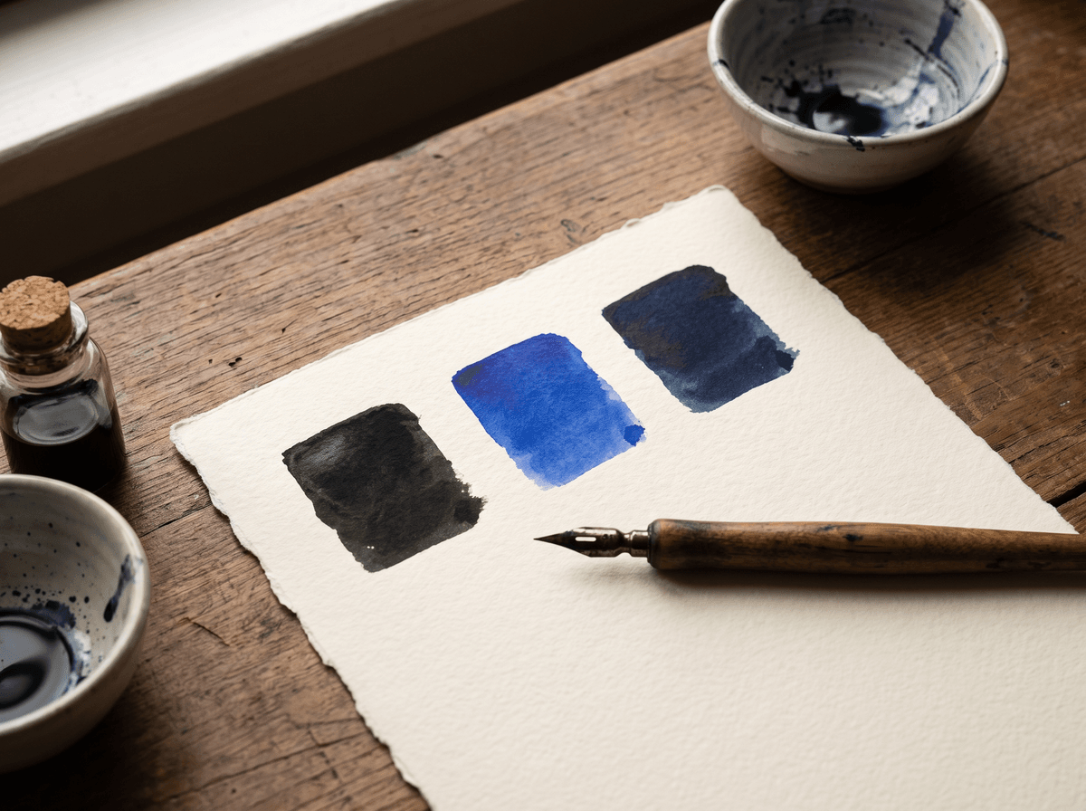
Swatch test: how to choose an ink
An ink's colour in the bottle, on the label and on paper are three different things. Before settling on a colour, make some simple swatches. All you need is a sheet of good paper and your pens, or a dip pen.
- 1Set up a swatch sheet. Write the names of your inks across the top, and under each one draw a thick band and a thin line.
- 2Write your full signature. At least three times in each colour. Contrast really shows in the loops and the finishing stroke.
- 3Wait until it's dry. Many inks change as they dry; judge only the dried sample.
- 4Check it in different light. By a window in daylight and under an evening lamp. Navy, for example, can look almost black under artificial light.
- 5Copy or photograph it. A phone photo or a black-and-white copy reveals which colour stays legible once a document travels onward.
Care and cleaning
A fountain pen can last for decades with a little care. The most common problem is dried ink: leave a pen unused for a few weeks and the ink dries in the nib slit and the feed, so the pen hesitates or won't write at all. A simple routine prevents most of this.
- 1Empty the pen. Write out or squeeze the remaining ink back into the bottle, or remove the cartridge.
- 2Flush with lukewarm water. Draw up and expel clean lukewarm (not hot) water several times until it runs completely clear. For a cartridge pen, hold the nib section under water in a glass.
- 3Soak stubborn ink. If ink has dried in, leave the nib section in a glass of water for a few hours. Avoid harsh chemicals or alcohol, which can damage the materials.
- 4Dry it thoroughly. Stand the nib point-down on folded kitchen paper and let it wick away the remaining water.
- 5Refill. Only fill a completely clean pen, especially when you're changing colour.

Paper texture
Paper is the other half of ink. The same pen draws a beautiful, full line on fine, slightly toothy paper, while on a cheap, loose-fibred sheet the ink spreads along the fibres and the edges of the line go fuzzy. That's called feathering. The opposite extreme is very smooth, coated paper: ink sits on the surface, dries slowly and smudges easily.
- Plain office paper. Ballpoints and fineliners work well. With a fountain pen, thinner sheets can show through, and a broad nib may feather.
- Heavier, slightly textured paper. Ideal for fountain pens: lines stay crisp, line variation shows clearly, and ink doesn't bleed through.
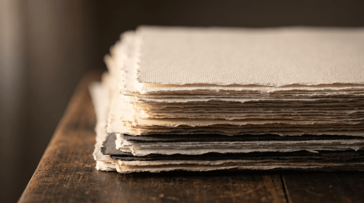
- Deckle-edged, cotton or handmade paper. For ceremonies, certificates and invitations. The texture adds character, but on very rough paper a fine nib can catch.
- Glossy, coated paper. Brochures, photos, cards. Use a ballpoint or a marker made for the surface, and give it plenty of time to dry.
Signing on different surfaces
In real life we rarely sign at a comfortable desk on nice paper. Far more often it's on the edge of a counter, on the back of a card, or on a parcel someone is holding out. A few situations worth being ready for:
- The back of a bank card. The signature strip is a special surface. Use a ballpoint or a fine permanent marker, and let it dry before it goes back in your wallet.
- Carbon-copy forms. The copies only come through with pressure, so this calls for a ballpoint and a firm hand. Fountain pens, gel pens and fineliners won't transfer.
- Glossy photos and book covers. Water-based ink beads up and smears on smooth surfaces. Use a permanent marker and don't touch the signature until it's dry.
- A soft surface or your knee. Without a firm base, a signature turns shaky. A book, a clipboard or even the back of your phone helps.
- Screens. On courier devices and tablets the movement is the same, but friction and feedback are completely different. We cover this in a separate guide: signing on screens.
Left-handers, long names and accents
- Left-handers. Your hand follows the fresh ink, so slow-drying inks smear easily. Fast-drying ink, a finer nib, or a ballpoint or fineliner all help. With a fountain pen, look for a fast-drying ink and rotate the paper slightly so your hand moves below the line rather than over it.
- Long or double-barrelled names. With a name like “Elizabeth Fairfax-Thornton”, a broad nib can make the signature look cramped. An F or M nib, or a fineliner, keeps all those letters cleaner. Our guide to legibility covers this in more depth.
- Accents and diacritics. Marks like é, ö or the Hungarian double accents ő and ű are tiny, fast strokes. If an accent is part of your signature's character, pick a pen that starts instantly.
- Very short names. A signature like “Al Day” or “Bo Li” has very few strokes, so line quality carries the effect. A broad or italic nib adds a lot, giving even a handful of letters real presence.
If your finishing stroke, the flourish or loop at the end, matters to you, watch how it tapers with different pens. A fountain pen fades out gently; a ballpoint stops abruptly. Our article on finishing strokes has more ideas.
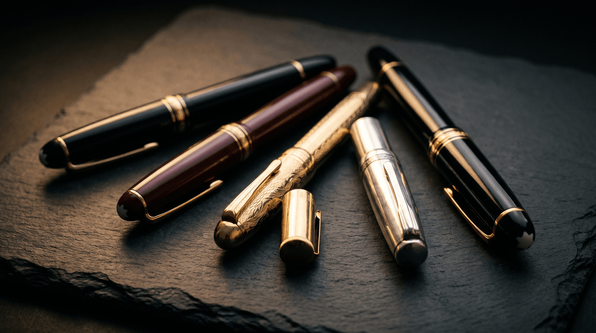
Budget or premium?
You don't need to spend much for a beautiful signature. Plenty of entry-level fountain pens write reliably, have replaceable nibs and are perfect for practice. More expensive pens differ mainly in materials, weight, finish and nib flexibility. Those are pleasant, but they won't make a hesitant movement confident.
- A reliable, simple pen with a steel nib
- Cartridge or converter, easy to clean
- No disaster if it's lost or dropped
- Ideal for daily practice
- Gold or finely tuned steel nib, smoother glide
- Weightier, better-balanced body
- Long-lasting, repairable, worth passing on
- For special occasions or as a gift
An expensive pen won't sign better for you, but it will show off a well-practised movement beautifully.
In Calligra you can learn your signature letter by letter, and the scored practice mode shows how your flow and confidence improve. Once the movement is truly in your hand, it will look good with any pen.
The one sentence worth taking away
Your signature is made of material as well as shape: nib, ink and paper shape how it comes across together. Practise with the pen you sign with most often, and test your signature with a fountain pen, a ballpoint and a fineliner. For official paperwork, black or navy is usually a safe choice, but if an institution asks for something specific, follow that. Keep your fountain pen clean, carry a reliable ballpoint, and before any important occasion, try your pen on the actual paper.
Questions
Which pen should I practise with?
Mainly the one you sign with most often, which for most people is a ballpoint. If you have a favourite fountain pen, practise with it too, but not exclusively: your signature also needs to hold up with a borrowed pen at the post office or a bank counter.
What nib size should I choose for my first fountain pen?
If your signature is medium-sized and not too crowded, a European M (medium) is a good starting point. If it's small or full of loops, go for F. With Japanese pens, expect nibs to write roughly one grade finer.
Does ink colour matter on official documents?
It can: some institutions specifically request blue or black ink, and requirements vary between institutions and countries. If you're unsure, ask them in advance. Where there's no stated requirement, black or navy is generally a safe choice because it reads clearly and shows up on copies.
Can I sign official documents with a fountain pen?
Usually there's no problem, but the ink you choose matters: some inks are more water-resistant than others. If a document needs to be kept for a long time, or the institution has specific expectations, check with them. On carbon-copy forms, only a ballpoint will work.
What should I do if my fountain pen won't start?
First try a few gentle strokes on scrap paper, or touch the nib to a damp paper towel. If that doesn't help, the ink has probably dried: flush the pen with lukewarm water and, for stubborn cases, soak it for a few hours. If it still writes unevenly, the nib may be misaligned.
I'm left-handed and everything smudges. What can I do?
Choose a fast-drying ink and a finer nib, or try a good fineliner. Rotate the paper slightly so your hand travels below the line rather than over fresh ink. Avoid glossy, coated paper.
Is an expensive pen worth it for my signature?
Only if it brings you joy. A premium pen feels nicer, glides more smoothly and can last for decades, but a signature's beauty comes mostly from a well-practised movement. Start with a reliable entry-level pen and good ink and paper; upgrade once the movement is secure.
Try it with your own name
Read these too
Knowledge Tools
How to sign a PDF on your phone: iPhone and Android, step by step
The contract has arrived by email and there's no computer around? With your phone's built-in tools or Adobe Acrobat Reader you can sign it in a few minutes. Step by step for iPhone and Android, with tips for a neat finger-drawn signature.
 Style
Underline, loop or tail? Finishing your signature
The last stroke sets the tone of a signature. Here are the most common finishes, what each one says, and how to pick the one that fits your name and the places you sign.
 Practical
Signing on screens: tablets, phones, terminals
At the door with a courier, at the bank, at a café counter: more and more often we sign on glass with a finger or stylus. Here's how to keep your signature recognisable and good-looking there too.