Knowledge › Style
Style
Underline, loop or tail? Finishing your signature
The last stroke sets the tone of a signature. Here are the most common finishes, what each one says, and how to pick the one that fits your name and the places you sign.
The same name reads very differently with a calm straight underline than with a big return loop or a tail flicked up and away. The letters carry your name; the finish carries its mood: whether it was written by a hurried hand, an orderly one, a playful one or a ceremonious one. Below we go through the common finishing strokes, what each expresses, how to match one to your name and to where you sign, which proportions work, why speed and tapering matter, and the mistakes that spoil an otherwise good signature, plus a week-long exercise plan.
Why the last stroke matters
When someone looks at a signature, their eye usually travels from left to right and stops where the pen lifted. That makes the finish the part that lingers longest. A shaky ending makes the whole signature feel unsure, however strong the capital. A clean, quick ending spreads confidence backwards: even the less legible middle looks intentional.
The finish is also the freest part of a signature. Letters have to resemble themselves at least a little, or the name disappears. A closing stroke has no “correct” shape: it can be straight, curved, looped, short or long. That's exactly why it's the easiest place to show your style, and the easiest place to overdo it. A good finish isn't the biggest one; it's the one that fits best.
The seven common finishes
Finishing strokes come in endless variations, but almost all trace back to a few basic types. Knowing them by name helps you choose deliberately.
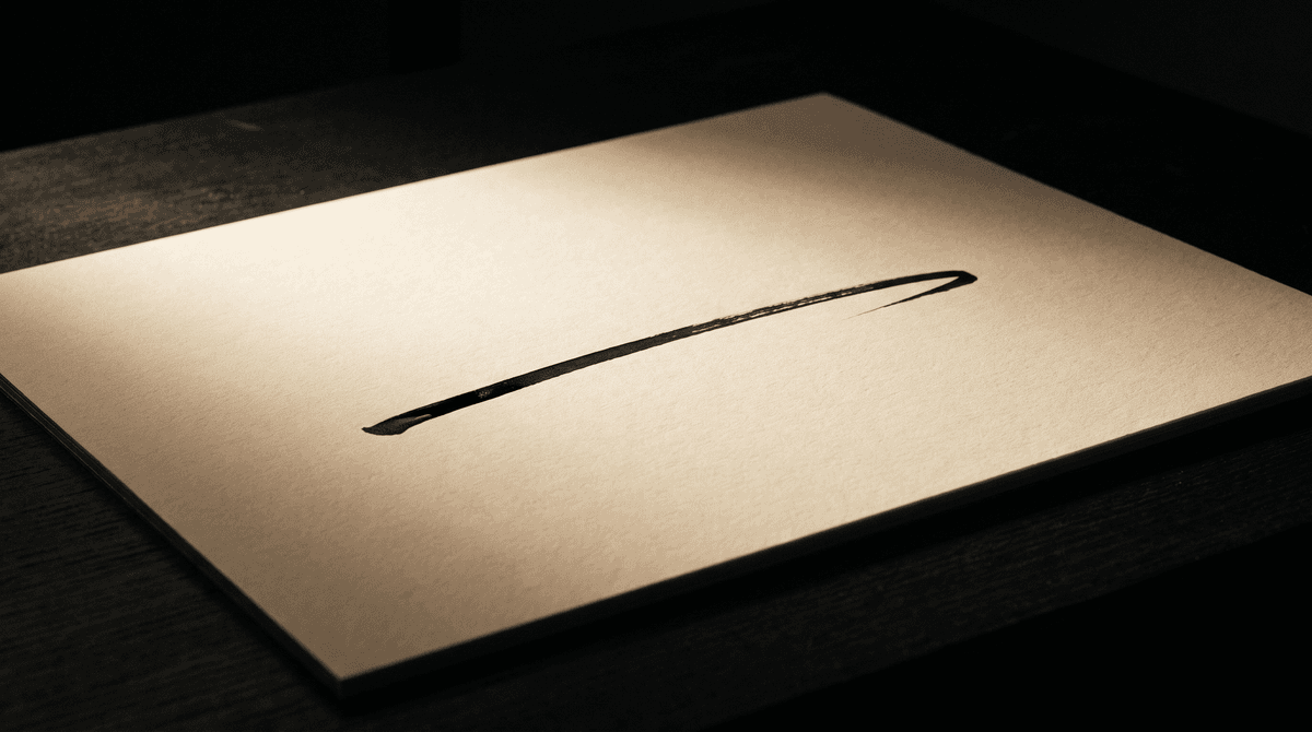
- Straight underline. A horizontal or gently rising line under the name. Orderly and decisive; at home on formal documents.
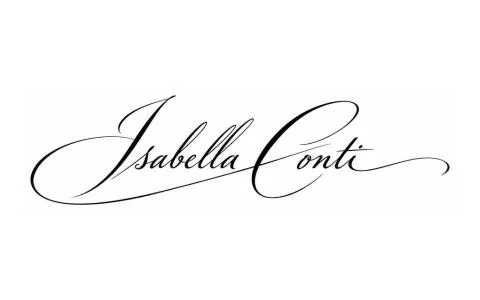
- Return underline (swash). From the last letter the pen turns back to the left and sweeps under the name in a curve. Elegant, confident, slightly ceremonial.
- Tail. The end of the last letter simply keeps going, to the right or upward, and thins out to nothing. Dynamic, fast, modern.
- Garland. The name trails off in a few soft, cup-shaped waves that run into each other. Relaxed, light, sometimes playful.
- Loop under the name. A larger closed or half-closed curve beneath the name, often tied to the capital or the last letter. Striking and characterful; needs more practice.
- T-bar finish. The crossbar of a t stretches out and takes over the job of the underline. Clever and economical, since one stroke does two jobs.
- No flourish. The signature ends with the last letter of the name. Clean and understated, and often stronger for it.
The underline and the return underline
The straight underline is the oldest and safest finish. It frames the name and gives the letters a floor to stand on. It works best when it isn't perfectly level but rises very slightly from left to right, and when it starts heavier than it ends. A dead-flat, even line looks ruler-drawn. As a rule of thumb, it matches the width of the name or stops a little short of it.
The return underline goes one step further. Instead of stopping at the last letter, the pen loops back and sweeps under the name from right to left. It's one continuous movement, so it reads as particularly quick and composed. Take a signature like “Peter Nash”: the h can drop into a curve and run back under the whole surname, tying it together. Keep the turn round, and don't let the return slice through descenders like g, j, p and y.
Tails, garlands and loops
These finishes are about movement. They suggest the hand kept going after it left the paper. That makes them lively, and also demanding: if the movement isn't fast enough, the line wobbles and the effect flips.
- A tail looks good when it's straight or only gently curved and thins out gradually. In a short name like “Anna Kovacs”, a stroke released up and to the right from the final s adds energy. Keep it no longer than about a third of the name.
- A garland is a row of small rounded waves, like a loose festoon. It suits longer names with lots of small, rounded letters that already have a wavy rhythm. Two or three waves are enough; more and it starts to look like a scribble.
- A loop under the name is the showiest choice. It often grows out of the capital's lower stroke and circles back beneath the name. It works only when the curve is complete and the loop stays open.
For all three, movement comes first and shape second. Drawn slowly, they never convince, so practise them on their own before attaching them to your name.
The t-bar finish and ending with no flourish
If your name contains a t, especially near the end, there's an option hiding in it. The crossbar doesn't have to be a short separate stroke: you can extend it so it reaches across the rest of the name and closes the signature from above instead of below. In “Margaret Hewitt”, for example, the bar of the final t can stretch back over the whole surname. One stroke does two jobs. The key is to run the bar above the letters, not through their middles, or the name stops being readable.
No flourish can look “empty” to some people, but it can be a very deliberate choice. If your capital is strong and the name is distinctive on its own, an extra line only takes something away; then the finish is simply the last letter, released cleanly so it tapers. On official forms, in tight boxes and on screens it's also the safest option, and it pairs well with our advice on building a strong capital.
A good finish isn't the biggest one; it's the one without which the signature would feel unfinished.
Speed and tapering
The quality of a finish depends less on its shape than on its speed. A fast stroke tapers naturally, because the pen lifts off while it's still moving. A slow stroke stays the same thickness to the end and often stops in a small blob where the pen came to rest.
- 1Start with pressure. Press into the paper at the start of the closing stroke; that's where the line gets its weight.
- 2Accelerate through the middle. As the line travels, speed up and gradually ease off the pressure.
- 3Lift while moving. The pen should leave the paper while your hand is still travelling. Don't stop and then lift: do both at once.
- 4Follow through. Let your hand carry on a few centimetres above the paper, like the end of a tennis swing. That's what gives you the hairline ending.
The tool matters too. A free-flowing fountain pen or rollerball shows tapering far better than a dry ballpoint that skips at the end of a line. If you're curious which pen brings out the best in your finish, see our guide to pens and inks.
Matching the finish to your name and its use
Two questions help here. First: what can your name carry? Second: where will you use the signature most? Short names can take a longer tail or a loop; long names already make a wide shape, so a restrained ending serves them better.
- Straight, gently rising underline
- Short, restrained return underline
- T-bar finish
- No flourish, with a clean tapered ending
- Fits inside a narrow signature box
- Large loop under the name
- Long tail flicked upward
- A garland of two or three waves
- A wider, ceremonial return sweep
- For dedications, cards and your own artwork
- Angular letters (lots of k, t, z, v) suit a straight or gently curved line; a very round loop can look foreign to them.
- Round letters (lots of a, o, e, m, n) pair well with a garland or a return sweep, which continues their rhythm.
- Descenders at the end (g, j, p, y) lead naturally into a loop or return underline that grows out of the letter's tail.
- Tall letters at the end (b, d, h, l, t) suit an upward tail or a t-bar finish better.
Proportions: how big should the finish be?
The most common problem isn't the wrong type of finish but the wrong size. Even a lovely swash can swamp the name if it's twice the size of the letters. These proportions are starting points, not strict rules.
- Length. An underline or swash should cover roughly two-thirds to the full width of the name. Anything longer becomes an element in its own right.
- Distance. Keep the underline about half a lowercase letter's height below the baseline. Too close and it sticks to the letters; too far and it floats away from them.
- Loop size. A loop shouldn't be taller than your capital. The capital and the finish balance each other: when they carry similar weight, the signature feels steady.
- Thickness. The finish shouldn't be heavier than the heaviest part of your letters, and it should always end thinner than it starts.
- Angle. A gentle rise of around 5–15 degrees adds lift. A finish that slopes downward tends to look tired or deflated.
Common mistakes and how to fix them
Almost every problem with finishes comes down to one thing: the line competes with the name instead of serving it.
- Crossing through the name. A return underline or t-bar runs through the middle of the letters and makes them unreadable. Fix: move the line down below the baseline, or up above the letters. There's more on this in our piece on legibility.
- Too long. The line runs far beyond the name and the eye follows it away. Fix: trim it to the width of the name and release it earlier.
- A blunt, blobbed ending. The stroke ends in a dot because the pen stopped before lifting. Fix: practise lifting while moving (see the speed section above).
- Inconsistency. A loop one day, an underline the next, nothing the day after. Fix: decide which version is your “official” one and practise it until it becomes a reflex.
- Too many flourishes. Loop, underline and tail all at once. Fix: pick one. The rest just crowd each other out.
- A wobbly curve. A slowly drawn loop or garland where the hesitation shows. Fix: simplify the shape until you can write it fast.
If people remember your flourish better than your name, the flourish is too loud.
An exercise plan for finding your finish
This plan takes about a week at ten to fifteen minutes a day. The aim is to find the finish that suits your hand and make it reliable.
- 1Strokes on their own. On day one, don't write your name at all. Fill the bottom of a page with closing strokes: ten straight underlines, ten return sweeps, ten tails. Notice which comes naturally.
- 2Shortlist. On day two, write your name with each of the seven finishes, at least twice each. Put the sheet away for an hour, then come back with fresh eyes and mark the best two.
- 3Head to head. On days three and four, write only those two versions, alternating, twenty times each. Whichever still looks even by the end is the winner.
- 4Speed. On day five, write your chosen finish faster and faster. If it falls apart at speed, simplify its shape.
- 5Real conditions. On days six and seven, sign in narrow boxes, on sticky notes and envelopes, even standing up. A good finish still works there.
Special cases
- Left-handers. For a left-hander, a left-to-right underline is often a push rather than a pull, which makes it harder and prone to smudging. Many find the return underline easier, because its final stretch runs right to left. Quick-drying ink helps.
- Long names. With a name like “Alexandra Fitzwilliam-Henderson”, a full-length underline would be enormously wide. Underline only the surname or the last section, or drop the flourish entirely.
- Double names. With hyphenated surnames or two first names, the finish can also act as a connector: a short return sweep holds both parts together so the shape doesn't fall apart.
- Accents and diacritics. Accents such as é, ü or the Hungarian double accents on ő and ű sit above the letters, so an overhead t-bar can easily collide with them. Choose a finish below the name instead, or write the accents as short quick ticks that don't compete with the bar.
- Very short names. With a name like “Ed Fox” or “Ida Lee”, the finish supplies part of the width. A longer tail or a loop is fine here; just keep an eye on the proportions.
- On screens. On touch surfaces the fast, tapering ending usually doesn't show, because line thickness tends to be uniform. Simple shapes win; there's more in our guide to signing on a screen.
When in doubt, choose the finish that comes out the same way under the worst conditions. That beats any spectacular curve.
Your finish in everyday life
If you've already given a specimen signature somewhere official, bear in mind that changing the finish may count as a deviation from it. Whether that matters, and whether you need to provide a new specimen, differs by institution and country, so always ask the bank or office concerned. If you're switching to a completely new signature, our guide to changing your signature walks you through it.
Plenty of people keep two versions: a restrained one for official use and a showier one for personal occasions. That's fine, as long as both are clearly the same hand and your official version always ends the same way.
The one sentence worth taking away
The finish is your signature's last word. Choose one that fits your name and the situation, keep it in proportion to the name, write it with momentum so it tapers, and write it the same way every time. A good ending closes and holds together everything before it.
Questions
Does a signature need a finishing stroke at all?
No. A signature without a flourish can be just as valid and just as handsome, as long as the letters have a steady rhythm and the last one ends cleanly with a taper.
Which finish works best on official documents?
Simple, easily repeatable shapes: a gently rising straight underline, a short return sweep, or no flourish at all. They fit into narrow boxes and are less likely to come out differently each time you sign.
My finish looks slightly different every time. Is that a problem?
Small variations are completely natural; you're writing by hand. The trouble starts when the type changes too, say a loop one day and an underline the next. Pick one and practise it until your hand writes it on its own.
Can I change my finish if my bank already has a specimen signature?
You can, but changing the finish may count as a deviation from the specimen on file. Whether that causes problems, and whether you need to provide a new specimen, differs by institution and country, so ask your bank or the office concerned directly.
Why does my closing stroke wobble?
Usually because you're writing it too slowly. A slow stroke shows every tiny movement of the hand. Speed up, and if the shape falls apart, simplify it.
I'm left-handed and I smudge my underline. What can I do?
Try a return underline, since its final stretch runs right to left, which is more natural for the left hand. Quick-drying ink helps too, as does angling the paper so your hand stays clear of the fresh line.
How can I see which finish suits my name?
The simplest way is to write your name on paper with each of the seven finishes and compare them an hour later with fresh eyes. In Calligra, the styles you try with your name show different finishes, so you can also compare the options side by side.
Try it with your own name
Read these too
Knowledge Style
Middle name in your signature: yes, if that's the name you use
Emily Rose, whom everyone calls Rosie. James Edward, who has gone by Ned since he was a baby. If you carry more than one name, your signature makes you choose: both, just one, an initial or the nickname. Here's when each one works.
 Style
Signature styles up close: what makes a signature elegant, modern or precise?
Eight styles, all drawn with the same name. Here's which strokes make a signature elegant, dynamic or precise, and where each one holds up in everyday life.
 Style
Signing a double-barrelled or hyphenated surname: how to keep it beautiful and quick
Two surnames, a hyphen, two capitals, and a signature box that hasn't got any longer. Here are the four solutions that work, and what to watch out for when the double name comes from marriage.