Knowledge › Style
Style
Old money signature: what makes a signature look expensive?
What does a “rich” signature look like? Not more ornament, but less. The six marks, a quick five-question test of how old money yours is, and a plan to get yours there without losing your movement.
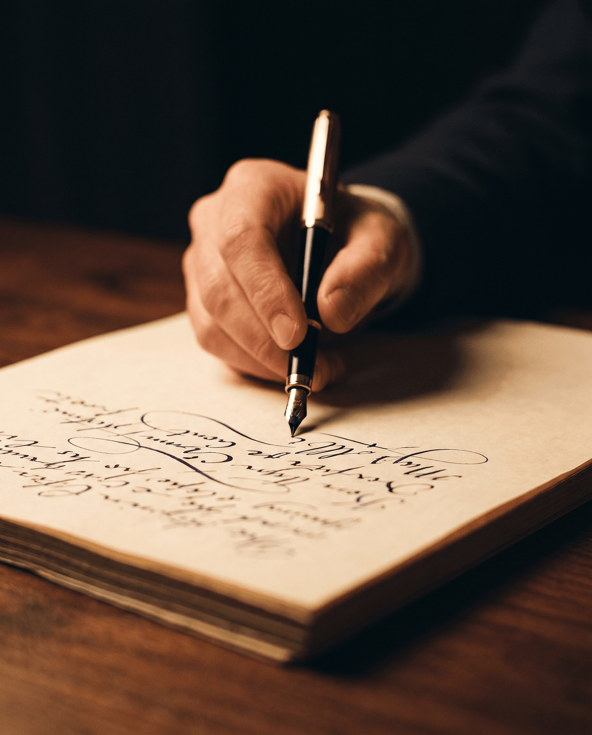
The old money look has made its way from clothes and homes to the pen: more and more people search for what a rich person's signature looks like, and why one name looks expensive while another looks like a hurried scribble. Let's say it right away: no signature reveals how much money is in someone's account, and no survey shows that wealthy people all sign their names the same way. An old money signature is an aesthetic, just like a well-cut coat with no logo. And that's the good news: an aesthetic can be learned, and its effect almost always comes down to the same few decisions. In this article we go through the six marks, look at what makes a signature look cheap, give you a quick test, and show you step by step how to get there with your own name. We don't copy real people's signatures: if famous examples interest you, they're in our article on famous signatures.
What is an old money signature?
Old money is the style of quiet wealth: it doesn't show what it cost and doesn't want to. Translated to a signature, that means nothing on it asks for attention. The hand isn't rushed or unsure, and it isn't trying to impress. Anyone looking at it thinks: this person has written this a thousand times and knows exactly what they're doing.
- restrained size;
- one well-formed capital;
- a consistent slant and rhythm;
- a short, clean ending.
- a size that fills the whole line;
- ornament and loops on every letter;
- a hurried line leaning every way;
- a double underline, a curlicue at the end.
It matters what we're not claiming. You can't read someone's character or finances from a signature: our article on graphology covers this in detail. Here we only look at the impression a form makes on whoever sees it, and that remains an impression, not evidence.

The six marks
Together, these six things create the feeling that a signature is “expensive”. They don't all have to be perfect: four already take you a long way.
- 1. Restrained size. The signature fits comfortably in its space, with air around it. A big size asks for attention; a moderate one suggests it doesn't need to.
- 2. One strong capital, no ornament. The first letter can be one and a half times the size of the others, but it's made of one clean movement. The character comes from its shape, not from loops wrapped around it.
- 3. A consistent slant. Every stem leans the same way, slightly to the right. Nothing gives away haste as quickly as letters leaning apart.
- 4. A calm rhythm. The letters follow each other at about the same distance, and the line doesn't speed up towards the end. It looks unhurried, even when you write it in seconds.
- 5. A recognisable name. Not every letter has to be legible, but the capital and the shape of the name should give away who wrote it. Our article on legibility helps you find the balance.
- 6. A short, clean ending. The line tapers off or simply stops. If there's an underline, it's short and a single stroke. A calm finish adds a lot to the whole.
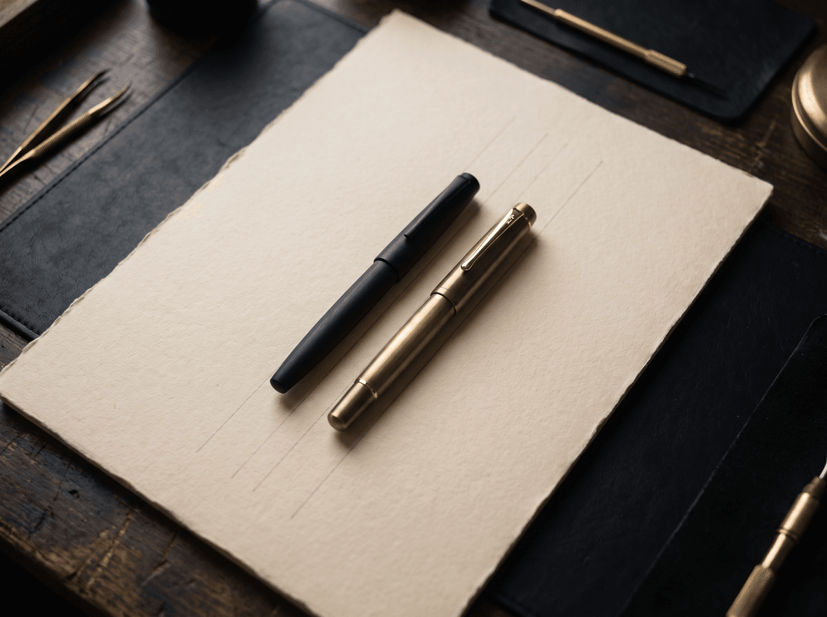
An old money signature doesn't say: look at me. It says: I've done this many times.
What makes a signature look cheap?
The same things as with an outfit: too much, too loud and out of place. These are worth dropping first, because leaving something out brings results faster than any new form.
- Ornament instead of certainty. Lots of loops often try to hide the fact that the form itself doesn't hold together. Strip the ornament and you see what's underneath, and that's something you can work on.
- Glittery or coloured ink. Purple, gold and glitter can be lovely on a card, but on an everyday signature they look playful rather than elegant.
- An overlong underline. A line running to the edge of the page, or a double one, looks like effort, and it won't fit in tight spaces anyway.
- A slowly drawn form. A signature drawn slowly has a trembling line, and you can see that at a glance. Confidence comes from momentum, not from careful copying.
Quick test: how old money is your signature?
Sign five times, one under another, at your usual pace, hold it at arm's length and answer these. Every yes is one point.
- 1Does it fit comfortably in a normal signature box? If it spills out or gets squashed, size is the place to start.
- 2Is one capital the star? If several compete for attention, or none does, the whole looks confused.
- 3Does every stem lean the same way? Don't look at your nicest one. Look at all five.
- 4Would it hold up without ornament? Mentally cover the loops and the underline. If a proper form remains, you're on the right track.
- 5Do all five look the same? Consistency is the surest sign that your hand knows what it's doing.
0–1 points: still a lot of rush, so start with size and slant. 2–3 points: a good base, just take something away. 4–5 points: already quiet and tidy, with little left to polish but the ending. This isn't a scientific measure, only a game, but it shows you exactly where to begin. Send it to someone who's sure theirs is the most elegant.
Old money, CEO or billionaire signature?
Many people lump these three together, but they mean different things. All three are stereotypes rather than rules, but they describe well the effect you're after.
- Old money. Quiet, classic, more legible. Traditional proportions, a moderate slant, nothing loud. It suits letters, contracts and official papers well.
- CEO signature. Fast, short and decisive. Because of all the signing, it's often just the capital and a sweeping line. Its message is closer to: I have things to do.
- Billionaire or celebrity signature. Big and memorable, often almost a logo. Excellent as an autograph, but it rarely fits at an everyday counter and is hard to repeat the same way.
If you can't decide which is closest to you, you can look at them up close in our article on signature styles. If your work is what makes you ask, our article on a professional signature is the place to go next.
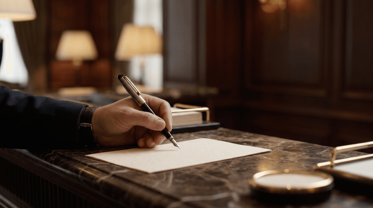
Pen, ink, paper: how much do they matter?
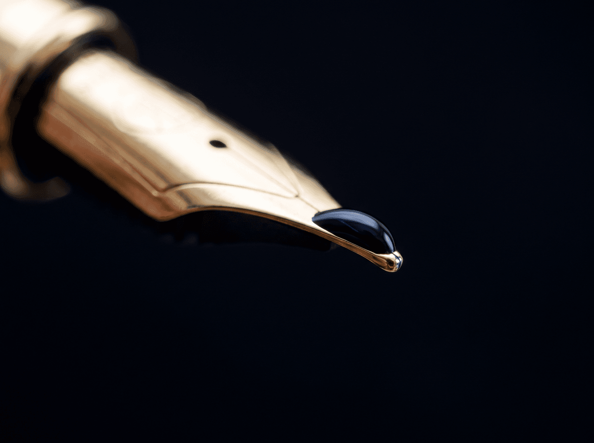
Less than you'd think. A good form looks good with a simple pen, and an untidy one stays untidy with an expensive fountain pen. A few things do help, though.
- Dark, classic ink. Black and navy are the safe choices. Royal blue also works well if you want to tell an original from a copy on paper.
- A fine or medium line. A thick, smudgy line weighs the form down. A fountain pen, a fineliner or a good ballpoint will all do.
- The brand doesn't matter. A plain pen that sits well in the hand is far more old money than a showy branded one, and it hurts less to lose.
Our article on pen and ink goes into this in more detail.

How to shape your own
You don't have to start from scratch. Most signatures can get here by leaving things out and refining a little. One step a week is plenty.
- 1Take off the ornament. Write your signature without loops, underline or curlicues. This is your starting point, the form that stays.
- 2Set the size. Try it in a real signature box. If it's comfortable there, it will be elsewhere too.
- 3Shape the capital. One clean movement, one decisive starting point. Our article on the first letter has the steps.
- 4Even out the slant. Draw faint slanted lines on a sheet and write along them for five minutes a day, at your usual pace.
- 5Shorten the ending. A tapering stroke or a short line, and you're done. You'll find ideas in our article on endings.
- 6Write it fast. What only works slowly isn't yours yet. It's done when it comes out the same standing up, on the edge of a counter.
If this is more of a polish than a change, our article on a nicer signature has seven small adjustments. If your bank and your ID already carry the old form and the new one barely resembles it, read how to introduce a new signature. Rules vary by country and institution; this isn't legal advice.
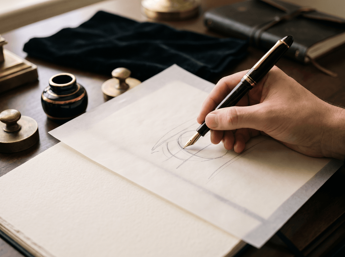
What does this look like with your name?
You can only really judge a style with your own name: a short name and a long one behave quite differently in the same form. In Calligra you choose from more than 70 styles, Old money among them, each shown with your own name. The AI draws your signature in the style you pick, then teaches it to you stroke by stroke, in slow motion too.
You can also write your current signature on the screen. The app scores it out of 100 on five criteria: legibility, uniqueness, elegance, balance and speed, with the reason behind every number. So you can see where the elegance slips. If you don't know where to start, the style quiz suggests one that suits you from eight questions.
The one sentence worth taking away
A signature doesn't look expensive because of ornament but because of restraint: a moderate size, one clean capital, a consistent slant, a calm rhythm and a short ending, all of which you can write the same way at speed.
Questions
What does a rich person's signature look like?
There's no single form, and a signature doesn't show how much money someone has. What we read as “rich” is usually restraint: a moderate size, one clean capital, a consistent slant and little ornament. It's an aesthetic anyone can learn.
What is an old money signature?
A quiet, classic-style signature that asks for attention in no way. It has few loops and no long underline, but it's tidy, even and confident, so it looks as if it has been written a thousand times.
What's the difference between a CEO signature and an old money signature?
A CEO signature is fast and short, often just the capital and a sweeping line. Old money is more classic and usually more legible. Both are restrained, but one emphasises speed and the other calm.
Do I need an expensive fountain pen?
No. A good form looks elegant with a simple pen that sits well in your hand. Black or navy ink and a line that isn't too thick matter far more than the brand.
Can I turn my current signature into an old money one?
Yes. In most cases it's enough to drop the ornament, set the size, clean up the capital and even out the slant. If the form stays recognisable, it usually causes no trouble. If it barely resembles the old one, it's worth asking your bank whether you need to give a new specimen.
Try it with your own name
Read these too
Knowledge Style
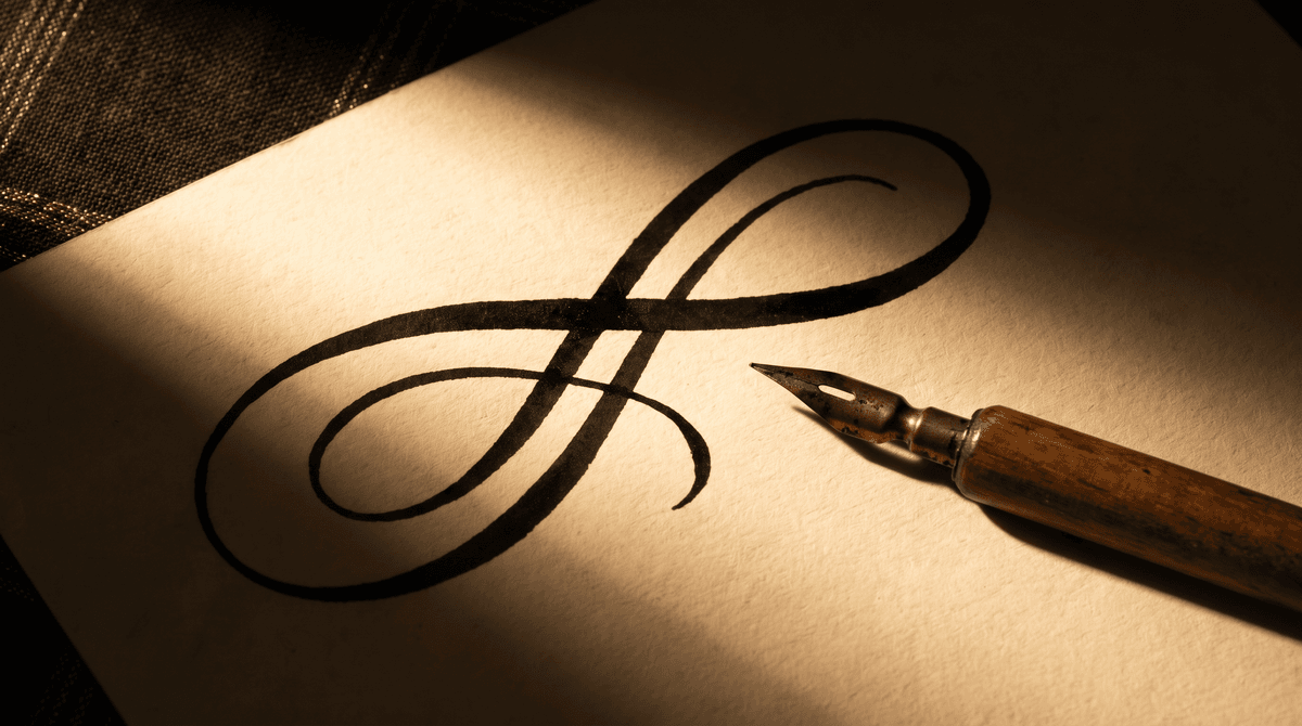
Can a signature include numbers or symbols? Hearts, stars, an 8 and drawn shapes
A little heart over the i, a star at the end of the stroke, a loop shaped like an 8 around the first letter: plenty of people want something of their own in their signature. We look at when a number or a drawn symbol works, where it can cause trouble, and how to add one so your name stays the main thing.
 Style
Designing the capital: the face of your signature
The first letter carries the character, the rhythm and most of the recognisability. Proportion, entry strokes, loops, connections and simplification, step by step.
 Style
Underline, loop or tail? Finishing your signature
The last stroke sets the tone of a signature. Here are the most common finishes, what each one says, and how to pick the one that fits your name and the places you sign.