Knowledge › Style
Style
Signature styles up close: what makes a signature elegant, modern or precise?
Eight styles, all drawn with the same name. Here's which strokes make a signature elegant, dynamic or precise, and where each one holds up in everyday life.
Put two signatures side by side and it's rarely the letters that make them look different. The difference is in the line: how thick it is, where it loops, how far it leans, how big the capital is and how it ends. A style is simply a consistent set of those choices. In this article you'll see the same name written eight ways, drawn live by Calligra's signature engine. For each one we describe what makes it what it is and where it works well. If you still can't decide at the end, the style quiz suggests one from eight questions.
What is a style made of?
Six things are worth watching. Choose them deliberately and any name can be written in any style.
- Line weight. A thin, even line feels modern and light; a line that swells and thins feels ceremonial.
- Loops. Many big loops decorate but slow you down. Few or none speed you up and tidy things.
- Slant. A strong forward lean adds energy; an upright or barely leaning form adds calm.
- The capital. A tall, prominent first letter carries the whole signature. We covered it in detail in the article on capitals.
- The ending. An underline, a loop, a trailing line or nothing: the last stroke sets the tone. See the article on endings.
- Pace. The same shape drawn slowly looks stiff; written in one movement it comes alive. A style is only yours if it works at your speed.
The eight styles, one by one
Every example uses the same name, so only the style changes. As you scroll, the pen writes them again and again.
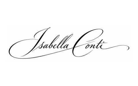
Elegant. The capital stands well above the rest, the loops run out long, and the line thins and swells. Beautiful on letters, invitations and gifts. In a narrow card strip, though, it easily gets squashed, so it's worth practising a smaller, simplified version alongside it.
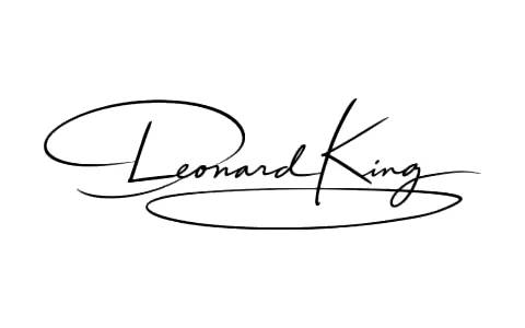
Classic. Round, even letters, a moderate slant, a name you can follow. This style is strong wherever readability matters: contracts, official papers. It rarely dates, and it's easy to write the same way every time.
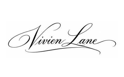
Modern. A thin, relaxed line, lots of space between the letters, a long wavy exit. Fresh and personal; it suits creators and young people especially well. Its weak spot is size: a thin line can vanish in a tiny box, so use a thicker pen there.
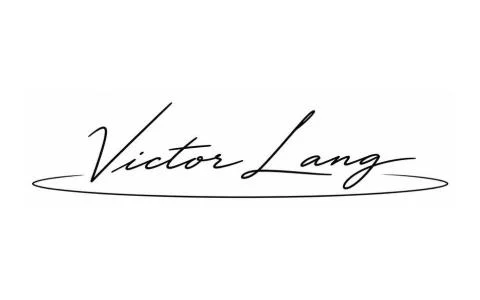
Clean. Nothing in it that doesn't need to be there. Quick, consistent and fine on screens, which is why many people choose it as their everyday signature. To keep it from being bland, give it one feature of its own: an unusual capital or a short, characteristic ending.
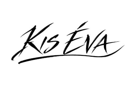
Confident. A strong start, straight decisive strokes, and an underline or straight line at the end. This style is very much “there” on the page. The trap is that the ending easily grows too long and drowns the name; keep it shorter than the name itself.

Dynamic. A strong forward lean, letters running into each other, the whole thing one movement. It's the closest to how most people sign in a hurry, only tidier. It works as long as the capital stays recognisable; otherwise it reads as a scribble.
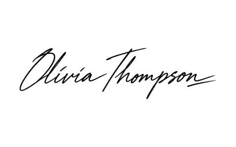
Precise. Pointed shapes, little roundness, a short exact ending or crossbar. It stays clean in small spaces and is hard to mistake for anyone else's. Make it too narrow and it turns stiff, so a little rounding at the corners makes it quicker and more natural.
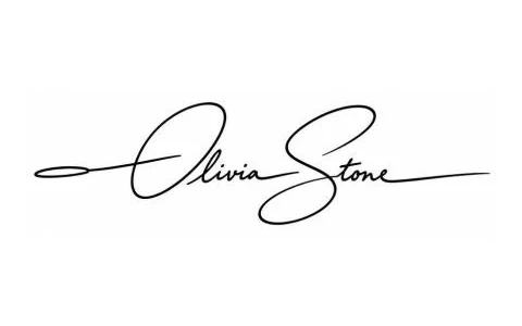
Balanced. Even size, a calm slant, a readable name and a modest ending. Not the showiest, but you can write it the same way in any situation: standing, at a counter, on a screen. A slightly rising baseline livens it up a lot.
Between two styles
Most good signatures aren't purely one style but a blend of two. That's not a flaw; just blend deliberately: one gives the structure, the other a detail or two.
- Elegant structure, clean ending. A tall, looped capital, then a simple name and a short, clean ending. Ceremonial, yet quick.
- Classic structure, dynamic pace. Readable, rounded letters, but with a stronger lean and written in one movement. Fine for official use without being stiff.
- Clean structure, one precise detail. A simple form with a single sharp element, such as an angular capital or a decisive crossbar. That's what makes it yours.
A style becomes yours when the hundredth signature comes out just like the first.
Which styles hold up in everyday life?
Your signature doesn't only live on a nice sheet of paper. It's worth seeing how it behaves where you actually use it.
- Clean
- Precise
- Dynamic
- Balanced
- Elegant
- Classic
- Modern
- Confident
That doesn't mean you can't sign for a parcel with an elegant signature. It means it will get simpler there, and it's better to decide in advance how. If you often sign in tight spaces, the article on small spaces helps. And if you're thinking of using different forms for different situations, first read when several signatures make sense.
Can't decide?
Then don't decide in your head. Two things usually help.
- 1Take the style quiz. The style quiz asks eight questions about where, with what and how fast you sign, and at the end shows your own name in the style that suits you.
- 2Write your two favourites ten times each. One under another, at your usual pace. Whichever row looks more consistent is your style. For practising it in, the practice article has a one-week plan.
The one sentence worth taking away
A signature's style comes from six choices: line, loops, slant, capital, ending and pace. Pick the set that comes out the same way every time at your own speed.
Questions
Which signature style is best?
There isn't one. What matters is whether the style suits where and how you sign, and whether you can write it the same way every time. An elegant signature is beautiful on letters; a clean one is faster at a counter.
Can I change my style if I already have a signature?
Yes. The easiest way is to keep your current capital and rhythm and change only the line, the loops or the ending. If you want to introduce a completely new form, changing your signature describes the steps.
Does my style reveal what kind of person I am?
No. Style is a matter of taste and use, not a character sketch. Why personality can't be reliably read from handwriting is covered in our article on graphology myths and facts.
How do I find my own style?
Take the style quiz, or write your two favourite styles ten times each, one under another, and see which stays more consistent.
Try it with your own name
Read these too
Knowledge Style
Old money signature: what makes a signature look expensive?
What does a “rich” signature look like? Not more ornament, but less. The six marks, a quick five-question test of how old money yours is, and a plan to get yours there without losing your movement.
 Style
Accents in your signature: é, ö, č, ł and the rest
An accent can be a stray dot, or one of the nicest details in your signature. When to add it, what shape to give it, how it survives haste and screens, and what to do with Czech, Slovak, Polish, Romanian, Turkish or French letters.
 Style
Style lessons from famous signatures (no graphology)
John Hancock, Elizabeth I, Napoleon, Lincoln, Shakespeare: what the proportions, capitals and flourishes of history's best-known signatures can teach you, without character readings and without copying.