Knowledge › Basics
Basics
What makes a signature look professional?
It isn't the number of flourishes. Flow, a strong capital, a consistent slant, good proportions and a clean finish make a signature confident and repeatable.
At the bottom of a contract, on a bank form, on a delivery slip, inside a birthday card: your signature often arrives before you do. Yet most of us invented one as teenagers and never thought about it again; over the years it wore down and drifted. The good news: a professional signature isn't a matter of talent, it's a handful of deliberate choices. Below we go through flow, the capital, slant, proportion, the finish, confidence and consistency, each with an exercise, plus a checklist at the end.
What “professional” actually means here
When someone calls a signature professional, they rarely mean the curls. They mean the writer clearly knew what they were doing: no hesitation, no wobble, and it looks the same on the next page.
That impression rests on four qualities. They are directions, not rigid rules.
- Recognisable. It looks like yours, not like a generic tangle of loops that could belong to anyone.
- Repeatable. Written ten times in a row, it looks like one signature, not ten of its cousins.
- Confident. It comes from a single movement. You write it rather than draw it.
- Fit for purpose. It fits a narrow box and doesn't look out of place at the foot of an important contract.
A professional signature isn't more ornate, it's more decided: you know why every stroke is there.
Flow: one movement, not a drawing
If you take one idea from this article, make it this: a signature is a movement, not a drawing. Built slowly, letter by letter, it kinks and pools ink where the pen paused. Written in one quick motion, the same name looks decisive, even if the letters are less tidy.

- Fewer pen lifts. Connect whatever you can. One lift between the capital and the rest is plenty, and at most one more between first and last name.
- Even tempo. Don't slow down for awkward letters. If a letter always trips you up, the problem is the letter, not you: simplify it.
- A planned route. Know where you start and where you end before the pen touches paper. The pen shouldn't be searching for the way.
- A brave exit. Let the last stroke run out instead of braking as if you were afraid of it.
- 1Write it in the air. Pen in hand, held just above the paper, write your signature three times with your eyes closed. Notice where your hand catches.
- 2Warm up with waves. Fill a sheet for thirty seconds with connected waves and loops, without lifting the pen. This sets your tempo.
- 3Write it ten times, fast. Not neatly, quickly. The tenth version is usually more fluid than the first.
- 4Mark the snags. Circle every point where you always slow down or lift the pen. Those are what you'll simplify.
A strong capital
The capital is the face of a signature. It's where the eye lands first and it carries most of the character. A well-formed, slightly taller capital keeps the whole thing composed even when the rest dissolves into little more than a wave. Neat small letters can't rescue a timid capital.
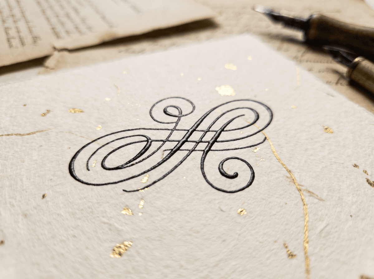
Take Anna Kovács: the upper arm of the “K” can swing into a loop while the lower one leads into the “o”. If you have two capitals, pick one to lead and keep the other simpler. There's more on this in our article on capitals.
A consistent slant
Slant is the invisible grid that holds the letters together. When every stem leans roughly the same way, the signature looks orderly even if it's loose. When one letter leans right, the next leans left and a third stands upright, the whole thing looks rushed and unsure, as if three different people had written it.
There is no correct angle. A right slant feels dynamic and forward-moving, upright feels calm and formal, and a left slant reads as more individual, sometimes a little reserved. Any of them can be elegant; what matters is that it's consistent.
- 1Draw guide lines. Pencil parallel diagonal lines across a sheet, about a centimetre or so apart, at whatever angle your hand falls into naturally.
- 2Sign along them. Every stem, loop and upstroke should run parallel to the lines.
- 3Compare. Put your old signature next to it and see where it strays most. Usually one or two letters are the culprits.
- 4Drop the grid. After a few days, sign without lines and check whether the angle has stayed.
Left-handed? Don't force a right slant because school taught it. Upright or a slight left lean is fine; turn the paper so your hand doesn't smudge the ink and let the slant follow.
Proportion: balancing tall and short
Proportion decides whether a signature looks balanced or accidental. Three relationships matter: the capital against the small letters, the length of the ascenders and descenders (l, b, h above; g, j, y below), and the overall width against the height.
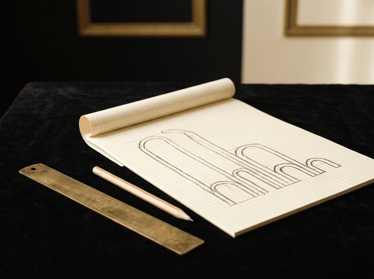
- Small-letter height as the unit. Treat the height of a, o and n as one unit and measure everything else against it.
- Upper loops. Reaching about twice the small-letter height tends to work well; loops that shoot much higher can make the shape restless.
- Lower loops. Keep them roughly as long as the upper ones, or the signature will seem to float or sink.
- Width. In a typical signature box, six to eight centimetres wide is comfortable. Much longer and it's worth shortening.
Long names, short names, double names, accents
The principles are universal, but names aren't. A few common cases:
- Very short names (say, Eva Kis). With so few letters, the signature can look thin. Give the capital a bigger role and use a decisive finishing stroke that fills the space.
- Long names. You don't have to write out every letter. After the capitals and one or two distinctive letters, the rest can become an even wave that suggests the length of the name.
- Double names. Decide which part leads. A common, effective solution is to write one surname more fully and reduce the other to its initial.
- Accents and diacritics. Don't drop them without thinking, but you don't need a separate pen lift for each one. The last accent can often merge with the finishing stroke into one small mark.
Whichever group you're in, the test is the same: if you can write it ten times in a row without slowing down, and every version looks like the same signature, you're on the right track. Legibility is a separate question, covered in detail in our article on legibility.
Confidence: what the line gives away
You can't draw confidence onto a signature, but it shows clearly in the line. Shaky edges, blobs where the pen stopped and retraced loops all betray an unsure hand, while a clean, brisk line looks decisive even in a simple shape.
- Many pen lifts, broken lines
- Slow tempo, ink pooling at corners
- Touch-ups and strokes traced over
- Letters shrinking towards the end
- A braked, blunt final stroke
- One or two lifts, a continuous route
- Even, slightly brisk tempo
- Written once, no corrections
- Similar letter size to the very end
- A tapering stroke that runs out
A decisive line is always worth more than a perfect letter drawn with hesitation.
Confidence is mostly practice. As long as you have to think about a shape, your hand will slow down. Once it comes from muscle memory, the line straightens itself out. So a simple signature you can write confidently beats an elaborate struggle. Our practice article has a daily routine.
Where you sign matters too

You sign seated with a good pen, standing at a courier's scratched screen, in cramped office boxes. A professional signature survives all of them.
- Narrow boxes. Practise signing into a small field, around a centimetre tall. If it falls apart there, the shape needs too much room.
- Touchscreens. A signature made with a finger or plastic stylus is always rougher. Flow and the capital carry recognisability here; we cover this in a separate article.
- Standing, no support. The simplest version wins. It helps if the shape is built so that a quick, simplified version still looks like the same signature.
- Many signatures in a row. By page ten of twenty, an elaborate shape slips. A good one holds.
In formal settings, keep one thing in mind: banks, public offices and other institutions often compare your signature with a specimen you gave them earlier. How that works, and what to do if you change your signature, differs by institution and by country, so always ask the institution itself. If you're planning a switch, our article on changing your signature walks through the practical steps.
The finishing stroke frames everything
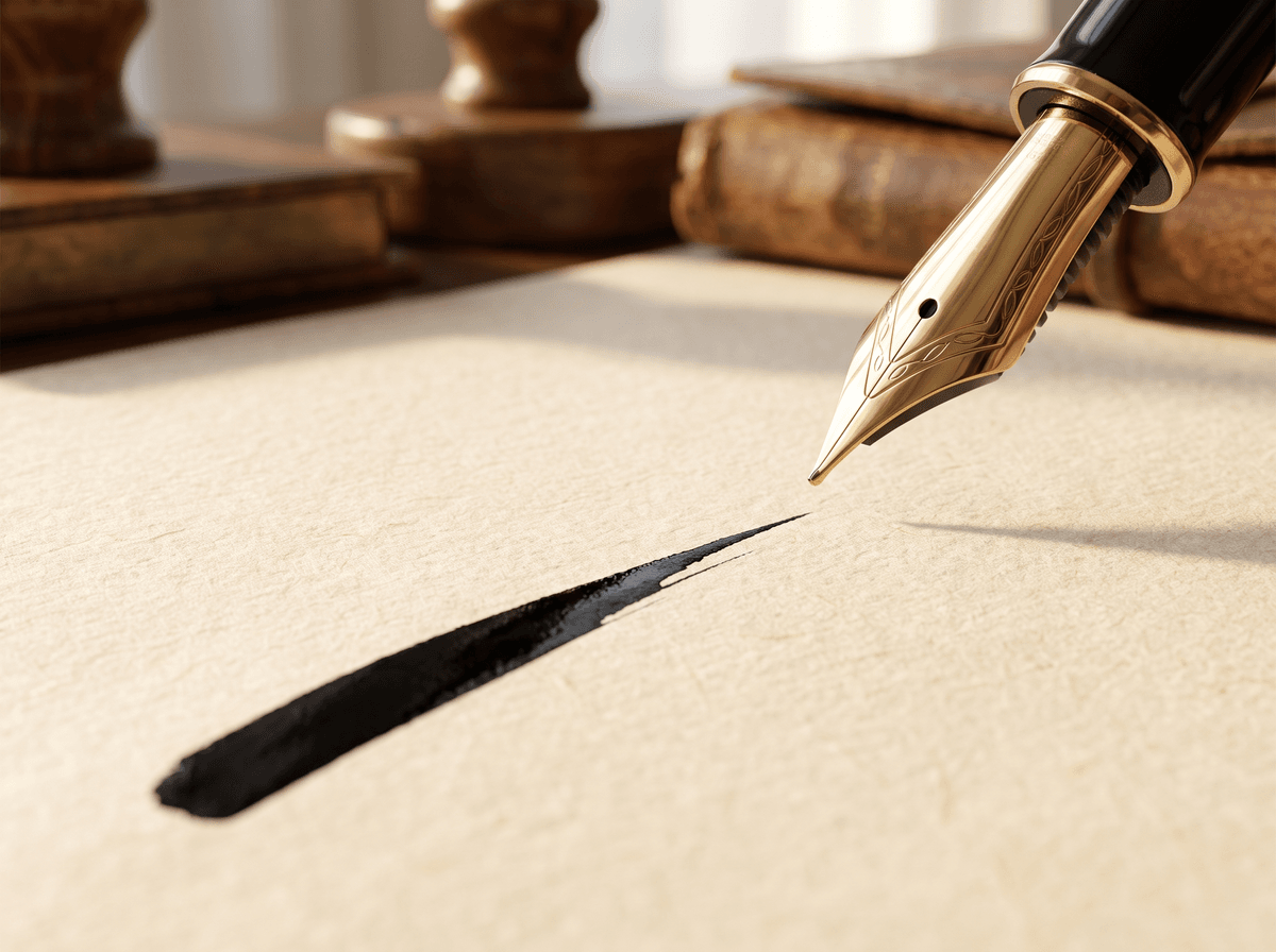
The last stroke works like the full stop at the end of a sentence: it closes the shape and makes it whole. It might be an underline, a tapering exit, a curve that swings back, or a short decisive mark after the final letter. Whatever you choose, make it intentional and repeatable.
- 1Pick one. One finish per signature is enough. An underline plus a sweeping curve is already crowded.
- 2Keep it simple. What takes three motions today will take two in three weeks, and it won't be the same any more. Choose something that's a single motion.
- 3Let the pen go. Lift the pen while it's still moving instead of stopping first. That's what gives the end of the line a thin, lively tail.
- 4Practise it on its own. Fill a line with just the finishing stroke. It's the fastest part of the signature, and when it's right the whole thing looks more assured.
If you can't decide which suits you, our article on finishing strokes goes through several proven types, with their strengths and pitfalls.
Consistency over time
The real test of a signature isn't how good it looks once, but whether it's recognisably the same six months later. Signatures naturally drift: they get shorter, faster, simpler. That's fine as long as the essentials survive: the shape of the capital, the direction of the slant, the type of finish and roughly the length.
Consider Peter Nagy. For years he used a long, carefully written signature that, under a steady flow of paperwork, quietly wore down into an “N” and a horizontal line. It no longer matched older specimens on file. The fix was a deliberate middle version, simple enough not to erode further.
- 1Record a reference. Write your chosen signature on a clean sheet and date it. This is your benchmark.
- 2Compare once a month. Sign again and put it beside the reference. Check the capital, the slant, the length and the finish.
- 3Correct in small doses. If something has drifted, a few minutes of practice is enough to bring it back. Don't wait until it has changed completely.
- 4Accept natural simplification. If an element keeps disappearing and the shape still works without it, that may be the better version. Update your reference.
In Calligra's practice mode, each attempt is scored against the design you chose, which makes it easier to notice when something is slowly drifting.
Common mistakes and how to fix them
- Too much decoration. Three loops, two underlines and a dot, and the eye doesn't know where to look. Take things away while the shape still feels like yours.
- A fading ending. The last letters get smaller and shakier. Fix: hold the small-letter height to the end and write the finish deliberately.
- Restless slant. One or two letters break the line. Fix: guide-line practice focused only on those letters.
- A capital that's too small. The signature has no head. Fix: enlarge the capital, even to twice its size, and see how it reads.
- Writing too slowly. You're drawing, not writing. Fix: deliberately speed up and accept that it will look rougher at first.
- Different every time. There's no fixed form. Fix: choose one version, write it down as a reference, and use only that for a week.
Most of these share a root: the signature is more complex than your hand can comfortably repeat, so the fix is usually subtraction. Tools matter too; see our article on pens and ink.
A checklist for your own signature
Sign your name five times, one under the other, at your normal speed. Then go through the questions below and answer each honestly with a yes or a no.
- Flow: can you write it with no more than two or three pen lifts?
- Capital: does it clearly stand out, and look similar in all five versions?
- Slant: are the stems roughly parallel?
- Proportion: are upper and lower loops about the same length, and does the small-letter size hold to the end?
- Finish: is there one intentional finishing stroke that looks the same five times?
- Confidence: is it free of tremors, ink blobs and corrections?
- Situations: does it fit a narrow box and work on a touchscreen?
- Consistency: do all five look like the same signature?
Two or three noes are nothing to worry about: they're exactly the points that are easiest to improve. If you'd like an outside view, Calligra lets you sign your current signature and scores it for flow, uniqueness, confidence and proportion, which makes a good starting point.
The one sentence worth taking away
A professional signature isn't more ornate, it's more considered: one fluid movement, a strong capital, a consistent slant, balanced proportions and a single intentional finishing stroke. And you can still write it the same way years from now. When in doubt, simplify.
Questions
How long does it take to learn a new signature?
It depends on how different it is from your old one, how complex it is and how often you practise. With a few minutes of regular daily practice, most people reach the point where the new shape comes without thinking within a few weeks. Slipping back early on is normal; regularity beats long sessions.
Is it a problem if my signature isn't legible?
Not necessarily. A signature's job is to consistently show your movement, not to spell out your name; the printed name next to it does that. That said, keeping at least the capitals recognisable adds a lot of character. Our article on legibility goes into this in depth.
How long should a professional signature be?
There's no required size, but in a typical box six to eight centimetres wide is comfortable. Very long ones don't fit narrow fields; a single letter and a line is hard to recognise. If your name is long, an even wave after the capitals suggests the rest nicely.
Can I have a professional signature as a left-hander?
Absolutely. Left-handed writing has a different natural slant and direction of movement, so don't try to copy right-handed models exactly. Turn the paper, use quick-drying ink, and keep any slant consistent. Everything else applies just the same.
Am I allowed to change my signature?
Generally yes, but do it thoughtfully. Banks, public offices and other institutions often compare your signature against a specimen they hold, and how a change should be reported differs by institution and country. Before using a new signature anywhere official, ask the institution concerned. Our article on changing your signature sums up the practical steps.
Does it have to look exactly the same every time?
No, and it won't. Two handwritten signatures never match perfectly, and that's as it should be. The goal is for the main features, the shape of the capital, the slant, the length and the finish, to be recognisably the same every time. Small variations are natural; large random ones are the problem.
Try it with your own name
Read these too
Knowledge Basics
How legible should your signature be?
Not every letter needs to be readable, but pure chaos isn't the answer either. Here's how to find the balance between legibility and personality.
 Basics
What does a signature reveal? Graphology myths and facts
A big capital, a long underline, a rightward slant: many people believe these reveal our character. Here's an honest look at what a signature can and can't tell you.
 Basics
How to create your own signature: step by step, with ideas
From a blank page to a signature you can write without thinking: how much of your name to use, the capital and the ending, ten style ideas, simple tests and a one-week plan.