
Knowledge › Basics
Basics
How legible should your signature be?
Not every letter needs to be readable, but pure chaos isn't the answer either. Here's how to find the balance between legibility and personality.
At school we were taught to write neatly, and plenty of people carried that habit straight into their signature. Others went the opposite way: one quick scribble that even they couldn't decode letter by letter. The sensible answer usually sits somewhere in between. A signature isn't a handwriting sample; it's the trace of a characteristic movement. It shows that you wrote it, not what your name is. Your name is almost always printed nearby anyway, in a header, a separate box or the line below. In this article we'll look at how legible a signature really needs to be, where full legibility genuinely helps, how a partly legible form works, what “harder to copy” means in practice, and why consistency matters more than anything else.
What is a signature actually for?
When you sign a contract, a delivery slip or a school permission form, you're not announcing your name. You're saying that you were there and that you stand behind what's on the page. To do that job, a signature needs two qualities: it should look recognisably the same every time, and it should point to you specifically, not to anyone who happens to share your name.
Legibility is secondary to that. It's convenient when someone glances at a page and wants to see who signed, but identification rarely depends on every letter being readable. It depends far more on whether the signature matches the one you gave as a sample, or the one on your documents.
- The same form every time
- A distinctive, recognisable capital
- Even rhythm and momentum
- A comfortable, natural movement
- Every letter being readable
- Textbook, school-style letterforms
- Writing out your full, long name
- Flourishes you can't repeat
A signature doesn't tell people what your name is. It tells them that you wrote it.
The legibility scale: three levels
It helps to treat legibility as a scale rather than a yes-or-no question. Between the two extremes there's a lot of room, and most signatures that work well sit somewhere in the middle.
- Fully legible. Every letter is clear and the name reads easily. It feels calm, orderly and dependable, but it's easier to copy at a glance and slow to write if your name is long.
- Partly legible. The capitals are clear, the rest of the name becomes a fluent, compressed line with one or two letters still recognisable. For most people this is the best balance.
- Rhythm over letters. A short, fast, characterful mark where the letters are only hinted at. It can look great in creative settings, but it's harder to repeat precisely and tends to drift.
Take Anna Kovács as an example. Fully legible, she writes both names out in even cursive. Partly legible, the capital A and K are crisp, “nna” becomes two rounded loops and “ovács” smooths into a wave. Rhythm-based, a strong K launches a single sweeping stroke that ends in a finishing line. Any of the three can be a good signature, as long as Anna writes it the same way every time.
Where full legibility helps
There are situations where a readable signature is a real advantage. Usually it isn't a rule; it just makes life easier for the person handling the paper and saves a round of “who signed this?”
- Handwritten forms without a name field. If there's no box for your printed name, the signature is the only clue to who filled it in.
- Internal paperwork. Leave requests, handover sheets, attendance lists: a legible signature spares colleagues the guesswork.
- Deliveries and collections. If you're accepting something on someone else's behalf, a readable name helps a lot.
- Community and school sign-ups. Parent consent forms, club lists and petitions where many people sign one below another.
The good news: you don't need to maintain two separate signatures. If you always print your name next to the box, a partly legible signature works just as well. The printed name carries the legibility, so the signature doesn't have to.
The partly legible form: clear capital, fluent rhythm
The idea behind a partly legible signature is simple: make the beginning unmistakable and let the rest move quickly. The eye reads the capital first, and if it's confident, the whole signature looks deliberate, even when what follows is little more than a rhythmic wave. We go deeper into this in our article on capital letters.
- 1Pick your lead letter. Usually the first letter of your first name or surname. Make it the largest, cleanest element.
- 2Keep the second capital too. If you sign two names, keep the second capital recognisable, just a little smaller.
- 3Smooth out the middle. Don't shape each lowercase letter individually; merge them into one rhythmic wave. An even wavelength matters more than accurate letterforms.
- 4Leave a few anchors. A tall l, a looped g or the dot on an i stops the signature becoming a featureless line.
- 5Finish with intent. A short exit stroke or underline frames the whole thing. For ideas, see our article on finishing strokes.
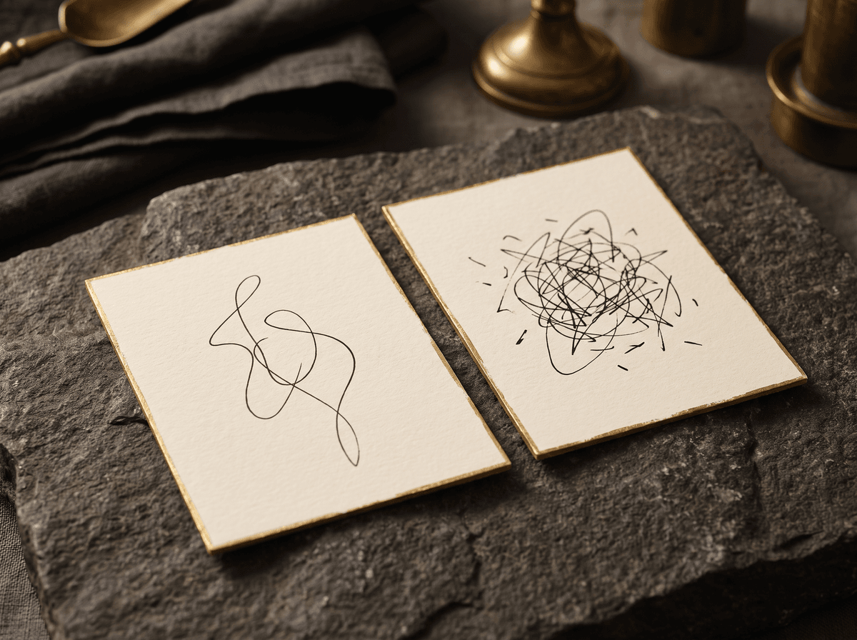
Peter Nagy, for instance, might make the P and N sharp and upright, turn “eter” into a short arc and “agy” into a slightly rising line with just the descender of the y dropping below. People who know him recognise it instantly; people who don't can still see it was written by someone with the initials P. N.
Personality versus legibility: finding the balance
Personality is what makes a signature yours rather than a generic cursive sample. It can come from an unusual capital, a characteristic slant, the spacing between letters or a distinctive ending. The trouble starts when you trade repeatability for personality.
- One distinctive but simple capital
- Your own slant, held consistently
- A single recurring flourish
- A comfortable pace, not a rushed one
- Complex loops that differ every time
- Flourishes stacked on flourishes
- So much speed the shape falls apart
- Deliberately unreadable chaos

Here's a useful test: write your signature five times, one under another, and see which element varies most. If the part that wobbles is exactly the part you think of as most “you”, that flourish is probably a passing idea rather than a real feature. Simplify it until it comes out the same five times out of five.
Personality isn't strong because it's complicated. It's strong because it shows up the same way every time.
Harder to copy: what that means in practice
Many people choose an unreadable signature because they assume it's harder to forge. There's a grain of truth in that, but it's worth being clear: no signature, on its own, protects you from misuse. How easy a signature is to imitate is just one factor; document security depends much more on procedures, checks and your own attention.
As far as the movement itself goes, a few general observations help. A fully legible, school-style signature can be drawn slowly, letter by letter. A fluent, confident one is harder, because speed, changes in pressure and the curve of each stroke are details that are difficult to get right while copying. But you can only keep that momentum if the signature is comfortable for you too.
- Momentum. A quick, confident line is harder to imitate convincingly than a slow, drawn shape.
- Natural pressure changes. Pen pressure shifts on its own as you write, and that shows in the thickness of the line.
- Personal proportions. The size of the capital relative to the rest, the slant and the spacing are all individual traits.
- Consistency. If yours always looks the same, it's easier to notice when one copy doesn't.

Forms, boxes and tiny fields
A signature rarely gets a generous blank page. Usually it's a narrow box, a dotted line or a small field, and that's where you find out how well it scales. A good signature stays the same in a smaller space; it just gets proportionally smaller.
- 1Size up the space first. Check how wide and tall the field is before you start. If it's tight, start the capital smaller rather than squeezing the end.
- 2Sit on the baseline. If there's a line, the body of your signature should rest on it. Ascenders and descenders can extend beyond it; the body shouldn't float.
- 3Scale everything evenly. Keep the ratio between the capital and the rest the same. Shrinking only the end makes the signature look unfamiliar.
- 4Shorten the exit stroke. In a tight box the finishing stroke can be shorter, but it should head in the same direction as usual.
- 5Stay out of other fields. If your signature regularly spills into the date or name box, practise the smaller version on its own.
Screens, signature pads and phones are a different story: the surface is slippery and you often write with a finger or a plastic stylus. We cover that separately in signing on screens.
Consistency matters most
If you take one thing from this article, make it this: a partly legible signature that always looks the same beats a beautiful one that's different every time. Consistency is what makes it recognisable, and it's also what makes an odd copy stand out.
- Same start. Begin in the same spot and move in the same direction every time.
- Same order. Dot the i, cross the t and add the underline in the same sequence.
- Same slant. If you lean right, always lean right, at roughly the same angle.
- Same pace. Don't slow down for important documents. A careful, hesitant signature often differs more from your usual one than a hurried one.
You can't will consistency into existence; you build it through practice. After a few weeks of short, regular sessions the movement moves into muscle memory and you stop thinking about it. Our article on practice gives you a concrete routine. Calligra's practice mode scores each repetition, so you can see when the form starts to settle.
Special cases: long, short, double and accented names
Legibility plays out differently depending on the name you have to write. Here are some common situations and approaches that suit them:
- Long names. Writing out “Christina Montgomery-Whitfield” in full is slow and tiring. A partly legible form is close to essential here: clear C and M, with the rest as a rhythmic wave.
- Very short names. A name like “Ed Fox” or “Al Li” can look too bare as a quick mark. Writing it out in full and adding personality through the capital or the ending often works better.
- Double-barrelled names. With “Esther Taylor-Smith” you don't have to treat every part equally. Many people emphasise the two surname capitals and only suggest the first name.
- Accents. Marks like the double accent in ő and ű, or a cedilla or tilde, are small but telling. Decide whether you include them, and if so, always draw them the same way.
- Left-handers. Writing left-handed, ink smudges more easily and the natural slant is often different. You don't need to force a right-leaning shape: an upright or slightly left-leaning signature is just as good if it's consistent.
With multiple first names, such as “Anna Maria Kovács”, the middle name is often dropped from the signature. If all your names appear on your official documents, though, it's worth asking the relevant institution whether they expect anything specific.
Common mistakes and how to fix them
- Too many flourishes. Three loops and two underlines usually means none of them can be repeated accurately. Keep one and drop the rest.
- A wobbly capital. If your lead letter changes each time, the whole signature looks unsure. Practise it on its own, ten to fifteen times in a row.
- Two signatures blending. Many people mix their quick everyday initial with their “official” version. Choose one main form.
- Slowing down when it counts. Signing slowly and carefully at the bank or on a contract makes the line shaky and different. Trust your usual pace.
- Complete illegibility. A line that resembles no letter at all is hard to scale and drifts easily. Give it at least one recognisable capital.

Exercise: find your own level
This exercise takes about twenty minutes. You'll need a few blank sheets and a pen you enjoy writing with. If you're not sure which pen to use, have a look at our article on pens and ink.
- 1Write three versions. Write your name fully legible, partly legible and rhythm-based, three times each.
- 2Look from a distance. Put the sheet at the far end of the table and see which looks most deliberate.
- 3Test it in a box. Draw a box about 6 by 1.5 cm and write each version inside. Which one fits naturally?
- 4Measure repeatability. Write your favourite version ten times, one under another, then circle the ones that genuinely match.
- 5Ask someone. Show it to a friend and ask what they can read. If they recognise the capitals, that's enough.
- 6Decide and stick with it. Choose the level that's comfortable, fits and repeats well, then practise it for a few weeks.
If you'd like ready-made suggestions, Calligra analyses your current signature and then lets you try more than 30 styles with your name, at different levels of legibility. Seeing them side by side makes it easier to decide which level suits you.
The one sentence worth taking away
What matters isn't whether everyone can read your signature letter by letter, but that the beginning is clear, the rest flows, and it's recognisably the same every time. For most people a partly legible form strikes the best balance: personal enough to be yours, orderly enough to hold up in a narrow box. Don't rely on the shape of your signature for security; that comes from your own attention and the procedures of the institutions you deal with.
Questions
Is it a problem if my signature isn't legible at all?
Not necessarily. If you always write it the same way and it's the one on your documents, it usually does its job. It's still worth giving it at least one recognisable capital, because that helps with scaling and consistency. What a particular institution accepts is always a question for that institution.
Which level do you recommend?
For most people, partly legible: clear capitals, a fluent continuation and one or two recognisable details. It's personal, quick to write and works well in small fields. With very short names, though, writing the name out in full is often the better choice.
Is an illegible signature harder to forge?
A fluent, confident line is generally harder to copy convincingly than a slowly drawn, school-style one, but that doesn't mean any style will protect you from misuse. Document security depends mainly on verification procedures. If you're concerned, ask the institution what options they have.
Can I have two signatures, a legible one and a quick one?
Many people use a shorter initial for everyday things like parcel deliveries and a fuller form for important papers. That can be fine, but mixing the two is the most common source of inconsistency. For anything official, always use the one form that matches your documents.
What if my signature doesn't fit on the form?
Practise a scaled-down version on its own: same proportions, same start, just smaller, with a shorter finishing stroke. Draw yourself a narrow box and sign inside it ten times in a row. Within a few days your hand learns to adapt to the smaller space.
Can I change how legible my signature is after years of signing the same way?
Yes, but do it deliberately and gradually. If the change is significant and you want to use it officially, ask your bank or the institution involved whether you need to provide a new specimen. Our article on changing your signature covers this in more detail.
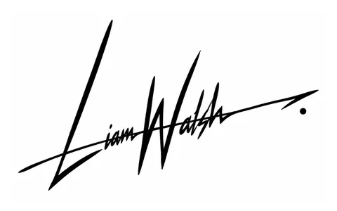
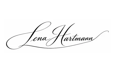
Try it with your own name
Read these too
Knowledge Basics
What makes a signature look professional?
It isn't the number of flourishes. Flow, a strong capital, a consistent slant, good proportions and a clean finish make a signature confident and repeatable.
 Basics
What does a signature reveal? Graphology myths and facts
A big capital, a long underline, a rightward slant: many people believe these reveal our character. Here's an honest look at what a signature can and can't tell you.
 Basics
How to create your own signature: step by step, with ideas
From a blank page to a signature you can write without thinking: how much of your name to use, the capital and the ending, ten style ideas, simple tests and a one-week plan.