Knowledge › Basics
Basics
The anatomy of a signature: the parts and what they do
Entry stroke, capital, body, ascenders and descenders, connections, ending: a glossary of every part of a signature, each defined in one sentence and walked through on a worked example.
When someone says “something's off about my signature”, they can rarely say what. Too big? Too messy? Too slow? The answer is much easier to find when you know what parts a signature is made of and what each one does. A signature has three main parts, the start (entry stroke and capital), the body (the remaining letters with their ascenders, descenders and joins) and the end (the finish), held together by a few overall qualities such as slant, proportion and rhythm. This article is a glossary: it defines each part in one sentence, walks through them on an example, and shows which part to look at when something isn't working. The rest of our knowledge base uses these terms.
Why it helps to know the names of the parts
Because what you can name, you can fix. If you know the problem is the x-height, you don't start the whole signature again; you just make your lowercase letters smaller. If you know the finish is too long, you only shorten that. Knowing the parts makes both designing and practising faster.
Some of these terms come from calligraphy and type design (ascender, descender, x-height), others are specific to signatures (the finish, the return underline). Together they give you a precise vocabulary for something most people only describe as “nice” or “messy”.
A signature from left to right: “Grace Bennett”
Before defining the terms one by one, let's see them on an example, in the order the pen travels.
- 1Entry stroke. The pen arrives before the “G” with a short, slanting curve from below.
- 2Capital. The big “G”, about two and a half times the lowercase height: this is the face of the signature.
- 3Descender. The lower part of the “G” dips below the baseline in a small loop.
- 4Connection. A short curve runs from the “G” into the “r” without lifting the pen.
- 5Body. The lowercase “race” sits at x-height along the baseline.
- 6Pen lift. Between the two names the pen lifts off: a short pause.
- 7Second capital. The “B” is smaller and simpler than the “G”, because a signature has one face.
- 8Double letters. The “nn” becomes an even wave, and the “tt” is joined by one shared crossbar.
- 9Ascenders and crossbar. The two “t” stems rise above the x-height; their crossbar is added at the end in a single stroke.
- 10Finish. The crossbar keeps going to the right, rising slightly and tapering away.
The start: entry stroke and capital
- Entry stroke (lead-in). The short line or curve with which the pen arrives on the paper before the first letter, setting the signature's starting direction and momentum.
- Capital (initial). The first and usually tallest letter of a signature, which carries most of its character and is the first thing the eye recognises.
- Secondary capital. The initial of the other name, which in a good signature is smaller or simpler so it doesn't compete with the first.
- Loop. A closed or half-closed curve where a letter's line turns back on itself; it decorates and connects, but every loop slows the signature down.
Designing, proportioning and simplifying the capital is covered in a detailed article.
The body: lowercase letters, ascenders and descenders
- Body. The part of the signature after the capital, the run of lowercase letters that provides length and rhythm.
- Baseline. The imaginary line the letters sit on; it can be straight, rising, falling or wavy.
- X-height. The height of lowercase letters without stems, such as “a”, “e” and “o”, and the most important measure of a signature's size and legibility.
- Ascender. The part of a lowercase letter that rises above the x-height, like the stems of “b”, “d”, “h”, “k”, “l” and “t”.
- Descender. The part of a lowercase letter that drops below the baseline, like the tails of “g”, “j”, “p” and “y”.
- Spacing. The distance between letters; even spacing looks tidy, uneven spacing looks rushed.
Ascenders and descenders break up the body: a name made only of x-height letters looks flat, and the stems give it height and depth. That's why it's important to make use of them with short names, as we explain here.
The joins: how it all links together
- Connection (join). The line that links the end of one letter to the start of the next, so the pen can carry on without lifting.
- Pen lift. The point where the pen leaves the paper and the signature continues after a brief pause.
- Ligature. Two or more letters merged into a single shared shape, such as “tt” with one crossbar.
- Wave (abbreviated tail). The end of a name simplified into an even, wavy line that keeps only the letters' rhythm, not their shapes.
Fewer pen lifts make a signature faster and more unified; deliberate pen lifts break it up and make it more readable. When each works best is covered in our article comparing cursive and print signatures.

The end: finish, underline, dots
- Finish (ending). The final movement of a signature, which frames it and shows how the pen completed the stroke.
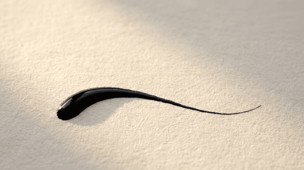
- Tail (exit stroke). The end of the last letter tapering off the paper, the simplest and most common finish.
- Underline. A line running beneath the name, often starting from the last letter, giving a firm, slightly formal look.
- Return underline. A curve that turns back from the last letter and runs left under the name, finishing and framing the signature in one movement.
- Crossbar. The horizontal stroke of a “t” or “f”, which many people add at the end in a single stroke, sometimes over the whole name.
- Dots and diacritics. The dots on “i” and “j” and any accents, usually added at the end in a separate movement, or left out.
- Flourish. Any stroke that isn't part of a letter but decorates, such as a long sweep or a spiral.
Types and proportions of finishes are covered in a separate article, and handling accents in this one.

Qualities of the whole signature
These don't describe a single part, but how the parts work together. The overall impression of a signature often depends on these more than on any decoration.
- Slant. The angle at which the letters' stems lean away from vertical; an even slant looks orderly, a changing one looks hurried.
- Proportion. The relationship between the sizes of the parts, above all the capital to the x-height, which in a good signature is roughly two to two and a half times.
- Rhythm. The regular repetition of letters, waves and pauses that makes a signature read as one unified movement.
- Speed (flow). How fast the signature is written, visible in how fluid the line is and how it tapers.
- Pressure. How hard the pen presses on the paper, visible in the thickness of the line and any indentation in the paper.
- Taper. The gradual thinning of the line at the end of a movement, a sign of quick, confident writing.
- Consistency. Repeating the same shapes, proportions and rhythm every time; the single most important quality of a good signature.

Related terms: signature, initials, monogram, autograph
- Signature. A mark written by your own hand, the same every time, that confirms you agreed to or signed a document.
- Initials (short mark). A short, quick version of your signature for page corners or internal paperwork.
- Monogram. A mark made from the initials of a name, often interlaced.
- Initialling. Marking every page of a multi-page document with your initials.
- Autograph. A handwritten name or mark given as a keepsake, which doesn't identify you but is a gift.
We've covered short forms in this article and autographs in this one. What generally counts as a signature is summarised in a separate article.
Troubleshooting: which part is the problem?
If something about your signature isn't working, the symptom usually tells you which part to fix:
- “It doesn't fit in the box.” X-height and finish: write the lowercase smaller, shorten the tail or underline.
- “It's a mess, nobody can read it.” The capital and the start of the body: make the capital and the first two or three letters clean.
- “It's different every time.” Loops and flourishes: less decoration, one main feature.
- “It's slow.” Pen lifts and loops: join more letters, drop a loop or two.
- “It looks flat and boring.” Ascenders, descenders and capital: give the stems room, raise the capital.
- “It looks unsure.” Speed and taper: write faster so the end of the stroke trails off instead of stopping.
- “It leans and falls apart.” Slant and baseline: practise between slanted guidelines.
The parts and Calligra's scores
Calligra scores your signature on five criteria. Each one relates to a group of the parts above:
- Legibility. Mainly the capital and the start of the body: can you tell whose signature it is?
- Uniqueness. The capital, the joins and the finish: how distinctive is the shape?
- Elegance. Proportion, loops, slant and taper: how harmonious and light is the line?
- Balance. Baseline, spacing and proportion: how orderly is the whole?
- Speed. The number of pen lifts and loops, and the flow: how quickly can it be written in one movement?
So you don't just get a number; you can see which part is worth improving. Calligra then designs several signatures from your name and teaches them stroke by stroke with animation. Try it with your name.
The one sentence worth taking away
A signature has three parts, the start (entry stroke, capital), the body (lowercase letters, ascenders, descenders, joins) and the end (finish), held together by slant, proportion, rhythm and consistency; once you can name a part, you can fix it deliberately.
Questions
What are the parts of a signature?
Three main parts: the start, meaning the entry stroke and capital; the body, meaning the lowercase letters with their ascenders, descenders and joins; and the end, the finish. Slant, proportion, rhythm and consistency hold them together.
What is an entry stroke in a signature?
The short line or curve with which the pen arrives on the paper before the first letter. It sets the signature's starting direction and momentum, and is a distinctive feature of many signatures.
What's the difference between an ascender and a descender?
An ascender is the part of a lowercase letter that rises above the x-height, like the stem of a “d” or “l”; a descender is the part that drops below the baseline, like the tail of a “g” or “y”.
What is the finish of a signature?
The final movement: a tail, an underline, a return curve or nothing at all. The finish frames the signature and shows whether the pen completed the stroke confidently.
How big should the capital be compared with the other letters?
A good starting point is a capital about two to two and a half times the x-height of the lowercase letters. With short names it can be bigger; with long names it's better clean and restrained.
Try it with your own name
Read these too
Knowledge Basics
What makes a signature look professional?
It isn't the number of flourishes. Flow, a strong capital, a consistent slant, good proportions and a clean finish make a signature confident and repeatable.
 Basics
How legible should your signature be?
Not every letter needs to be readable, but pure chaos isn't the answer either. Here's how to find the balance between legibility and personality.
BasicsWhat does a signature reveal? Graphology myths and facts
A big capital, a long underline, a rightward slant: many people believe these reveal our character. Here's an honest look at what a signature can and can't tell you.